#Field element declaration
#Field element properties
| Key | Type | Description |
|---|---|---|
name | String | Name of the field element |
apiId | String | API ID of the field element |
type | field (required) | The type of element |
features | [FieldExtensionFeature] (required) | List of features implemented by the element (at least one) |
fieldType | FieldExtensionType (required) | What field type is your app element targeting |
url | String | URL of the field element |
description | String | Description of the field element |
fieldConfig | ConfigFields | Optional definition of field configuration settings. Supports the following field types: string, number, and boolean |
#FieldExtensionType enumeration
Supported FieldExtensionType enumeration values:
| Type | value type |
|---|---|
STRING | string |
INT | number (without decimals) |
FLOAT | number |
BOOLEAN | boolean |
JSON | any valid JSON value |
DATE | string in format 'yyyy-MM-dd' |
DATETIME | string in ISO 8601 format |
LOCATION | object { "latitude": number; "longitude": number; } |
COLOR | object { "rgba": { "r": number; "g": number; "b": number; "a": number; } } |
#FieldExtensionFeature enumeration
FieldRenderer: The element replaces a form field.ListRenderer: By enabling this feature, you indicate that the element can handle array values as well, and that Hygraph should call it directly instead of the default list renderer on multiple value inputs.TableRenderer: The element should also be used to display values in the content table.
#Field configuration
This is an example for the JSON object for the field configuration:
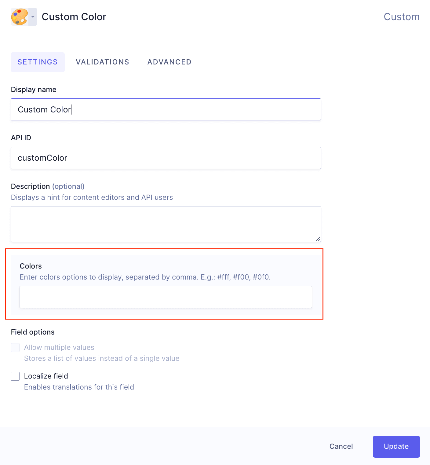
{"CUSTOM_COLORS": {"type": "string","description": "Enter color options to display, separated by comma. E.g.: #fff, #f00, #0f0","displayName": "Colors"}}
According to this example, when the form is rendered, it will render a field called CUSTOM_COLORS of type string, with the display name "Colors", and the description "Enter color options to display, separated by a comma. E.g.: #fff, #f00, #0f0".
This information will be sent as metadata to the app element, and will display in the schema editor - as part of the custom field that it was configured for - and users will be able to add it to their models.
The schema view of the above example would look like this:
 fieldConfig example - Field
To later retrieve this information, you can do this:
// Reading config data in Field Extensionfunction FieldElement() {const {extension: { fieldConfig },} = useFieldExtension();const colorsConfig = fieldConfig?.colors;return <div>{colorsConfig}</div>;}