# Card grid with components
This guide shows how to build a card grid using nested components
## Overview
**Do you have suggestions?:**
Join our community to suggest new recipe ideas!
This guide shows how to build a card grid using nested components.
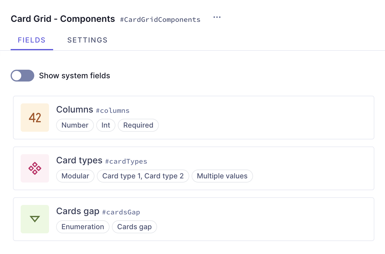
This card grid contains a number field so you can indicate how many columns the grid should have, a modular component that lets you select card types for your grid, and a dropdown menu to select the size of the gap between cards.
It is a good option when you have different card types but don't want your content entries to become very large and hard to manage. By adding all your card types to a modular component, you offer Editors the possibility to dynamically select which card type they need.
## Prerequisites
- You need to have a Hygraph account. If you don't have one, you can sign up here.
- You need to have a Hygraph project. You can:
- Create a project: This is the way to go if you want to follow the entire tutorial for learning purposes.
- [Clone the cookbook project:](https://hygraph.com/classic-docs/recipes/card-grid/card-grid-components#clone-project) This is the way to go if you're curious about how the card grids are made but don't want to follow the step-by-step creation process. This project contains the entire **Card Grid Cookbook** so you can compare them, or look into what instances they contain.
- **Use an existing project of yours:** If you have a project already and want to add this card grid to it, this is the way to go. In this case, you may need to adjust parts of the tutorial to your own project schema.
**Note:**
- Take plan limits into consideration when adding a recipe to your own project.
- Are you new to Hygraph? You may want to check out our Getting Started Tutorial!
## Core concepts
In this guide, you'll work with enumerations, components, basic component fields, modular component fields, and nested components. Let's look into these concepts:
- **Enumerations:** an enumeration is a predefined set of values that represents a list of possible options. You can use them to group values within a type.
- **Component**: a predefined set of fields that can be reused across models and content entries. You can think of a component as a flexible, reusable template: you define the fields that will be used inside a component once, and then fill them with different content every time you use it in a content entry.
- **Basic component field**: a component is a special field type in your Hygraph schema that defines which components of which type can be used in a model. Component fields can be of basic or modular types. A **basic component field** can only have one component attached to it. You can limit the number of component instances to one, or allow multiple component instances to be added in the content entry.
- **Modular component field**: a modular component field can have two or more components attached to it.
- **Nested components:** functionality that allows you to create components within a component, as if you had a parent component containing one or more child components.
## What you can do
This guide offers two paths:
- [Path 1:](https://hygraph.com/classic-docs/recipes/card-grid/card-grid-components/#step-by-step-guide) Use this guide to create a card grid component that you can reuse across different models in your Hygraph projects.
- [Path 2:](https://hygraph.com/classic-docs/recipes/card-grid/card-grid-components/#clone-project) Clone the project that contains the entire **Card Grid cookbook** to compare the different card grid configurations without having to clone multiple projects.
## Clone project
We have prepared a project that contains the entire **Card Grid cookbook**:
[Clone this project](https://app.hygraph.com/clone/5f1ac5e413bd42839cc16cf31071f0a6?name=Hygraph%20Recipes%20-%20Card%20Grid)
This cookbook contains all the recipes we have so far to create card grids, so you can compare the different card grid configurations without having to clone multiple projects.
To find this particular recipe in the cookbook project, navigate to the schema and look for **"Card Grid - Components"**.
This project also contains a demo model that includes all the card grid components in the cookbook as basic component fields, as well as a modular component field that you can use as a card grid type selector.
## Step-by-step guide
Before we can build components, we sometimes need to create other schema elements that will later be added to those components as instances.
We will divide this process in steps to make it more manageable:
1. **Create enumerations:** We will need to create three different enumerations to provide styling options.
2. **Create a component for links:** We will create a simple link component for one of the card types we will work on afterward.
3. **Create a component for buttons:** We will create a simple button component for one of the card types we will work on afterward.
4. **Create the card type components:** We will create two components with slightly different card designs. The aim is to have the possibility to select a card type for our grid later on.
5. **Create the card grid:** Finally, we'll combine all the elements we worked on before to generate a dynamic card grid with a modular component that allows card type selection.
### 1. Create the enumerations
We will start by creating the enumerations that we can later add to our components as dropdown menus that will let us select different style options for our cards and card grid.
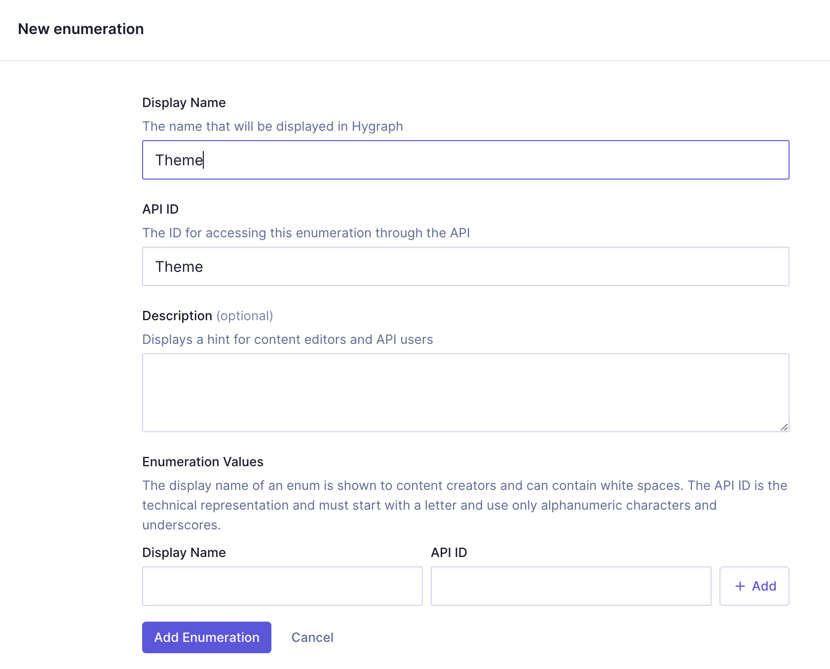
We'll start with the "Theme" enumeration. We'll navigate to our project schema and click `+Add` next to **Enumerations**.
We'll use the following information:
| Field | Input |
| ------------ | ----- |
| Display Name | Theme |
| API ID | Theme |
Next, we need to add enumeration values. These are the options we will get when using this later as a dropdown menu.
For the sake of this example, we will use simple styling options: dark & light. Later on, we will add this enumeration to our buttons and cards.
For every enumeration value, we need to enter a `Display name`, an `API ID`, and click `Add`.
We'll add the following values:
| Display name | API ID |
| ------------ | ------ |
| Light | light |
| Dark | dark |
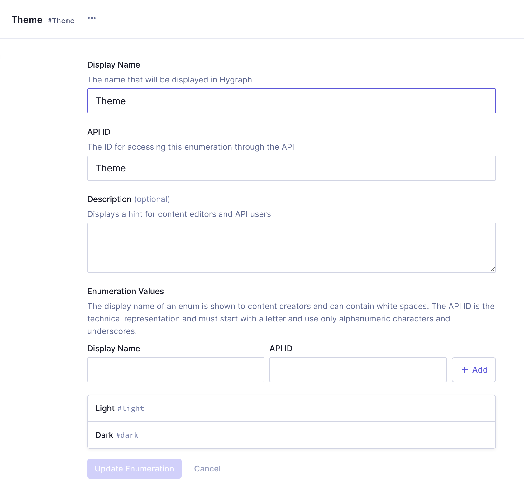
We'll click `Add enumeration` to save.
Now that our theme enumeration has been created, we'll create another one for padding, so we can later use a dropdown to decide what type of padding our cards will have.
We'll use the following information to create the enumeration:
| Field | Input |
| ------------ | ------- |
| Display Name | Padding |
| API ID | Padding |
Next, we need to add the following enumeration values in the same way we added values to the previous enumeration:
| Display name | API ID |
| ------------ | ------ |
| Large | large |
| Medium | medium |
| Small | small |
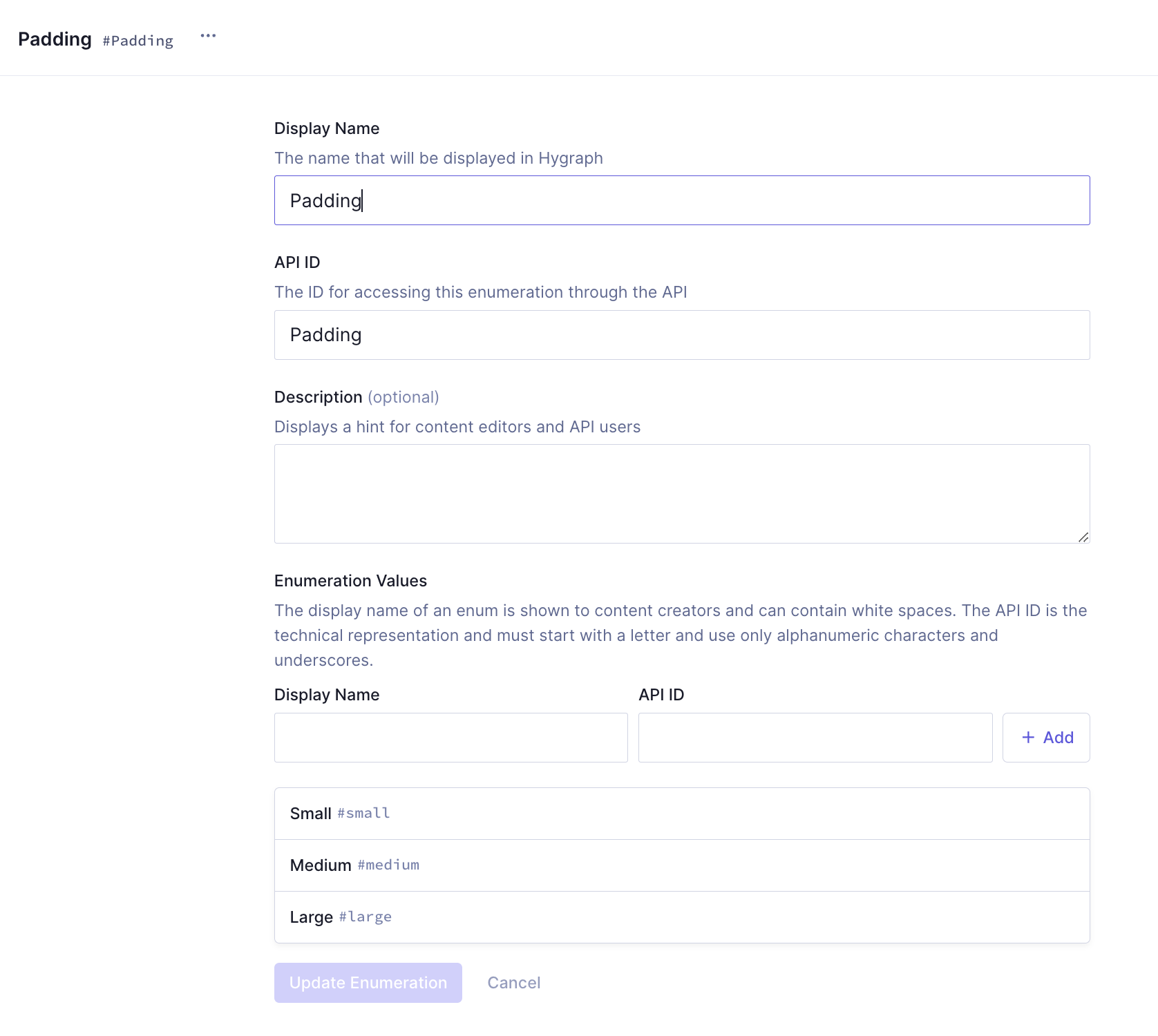
We'll click `Add enumeration` to save.
We'll create one final enumeration that we will later use to select the type of gap between our cards on the grid. We'll use the following information:
| Field | Input |
| ------------ | --------- |
| Display Name | Cards gap |
| API ID | CardsGap |
Next, we need to add the following enumeration values:
| Display name | API ID |
| ------------ | ------ |
| Large | large |
| Medium | medium |
| Small | small |
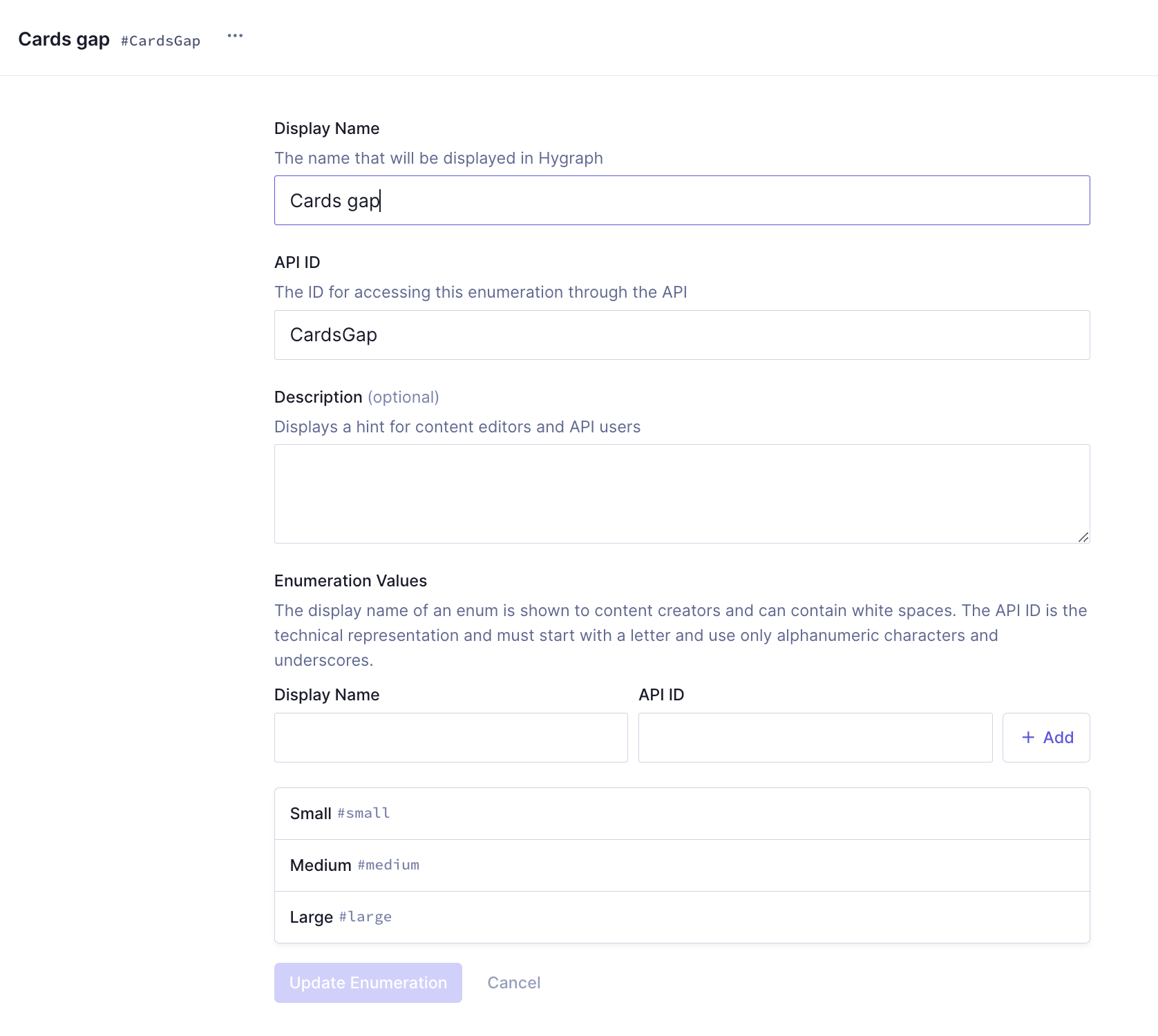
Finally, we'll click `Add enumeration` to save.
### 2. Create the link component
It is time to create our first component. Our cards will need to have a link, and in this case we'll create a simple component for that.
We'll click `+Add` next to **Components** and we'll use the following information to create one:
| Field | Input |
| ------------- | ----- |
| Display Name | Link |
| API ID | Link |
| API ID Plural | Links |
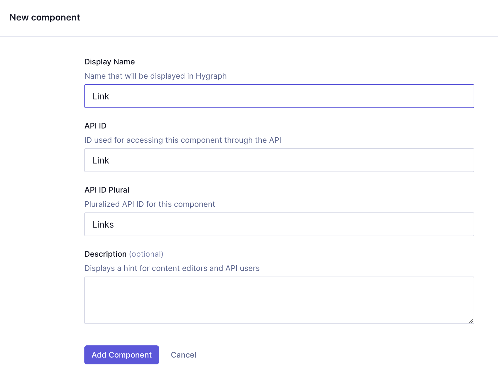
Click `Add component` to save.
We can now start adding instances to this component.
Let's start with a `Single line text` field, which will be the label of our link. We'll find it on the **Add fields** right sidebar, click on it, and use the following information:
| Tab | Field | Input |
| ----------- | ------------------------------ | ---------------------------- |
| Settings | Display Name | Link label |
| Settings | API ID | linkLabel |
| Settings | `Use as title field` checkbox | Leave this checkbox selected |
| Validations | `Make field required` checkbox | Select this checkbox |
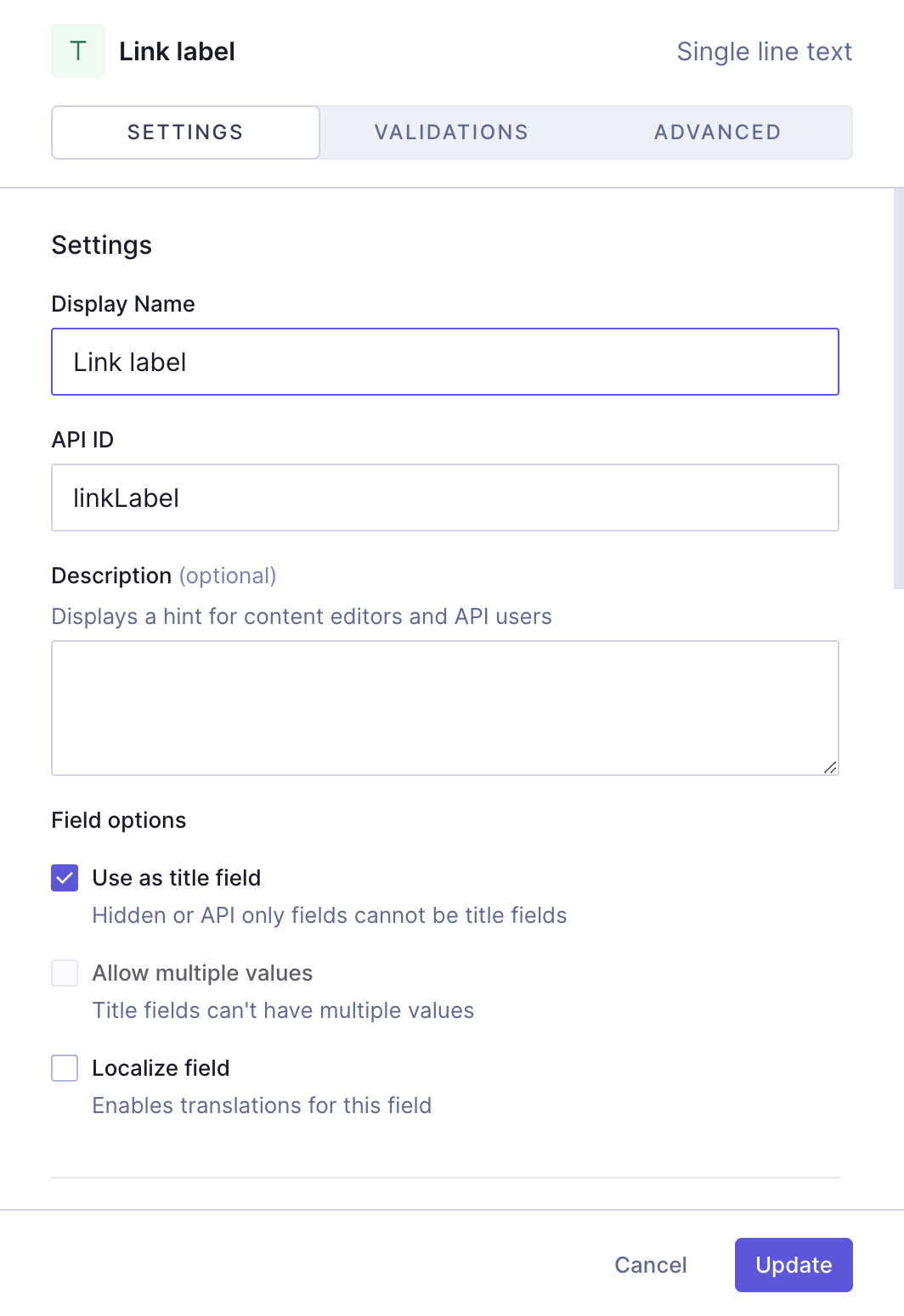
We'll click `Add` to save.
Finally, let's add a `Slug` field, which will be our link URL. We'll find it on the **Add fields** right sidebar, click on it, and use the following information:
| Tab | Field | Input |
| ----------- | ----------------------------------- | ---------------------------------------------------------------------------------------------------------------------------------------------------------------------------- |
| Settings | Display Name | URL |
| Settings | API ID | url |
| Settings | `Lowercase` checkbox | Leave this checkbox selected |
| Validations | `Make field required` checkbox | Select this checkbox |
| Validations | `Set field as unique` checkbox | Leave this checkbox selected |
| Validations | `Match a specific pattern` checkbox | Leave this checkbox selected, and use the dropdown to select the `URL` pattern. Write "Input value does not match the expected format." in the `Custom error message` field. |
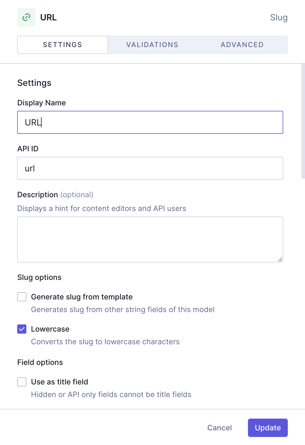
We'll click `Add` to save.
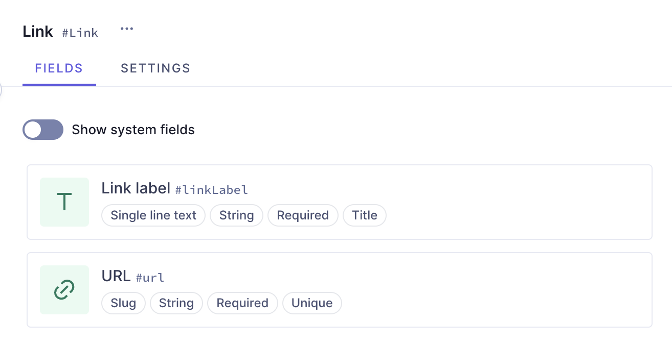
This is how you build a simple link component in Hygraph. You can add this component to different models in your schema. We will add this to our cards later on.
### 3. Create the button component
One of the cards we will create later will use a button component. Let's create it!
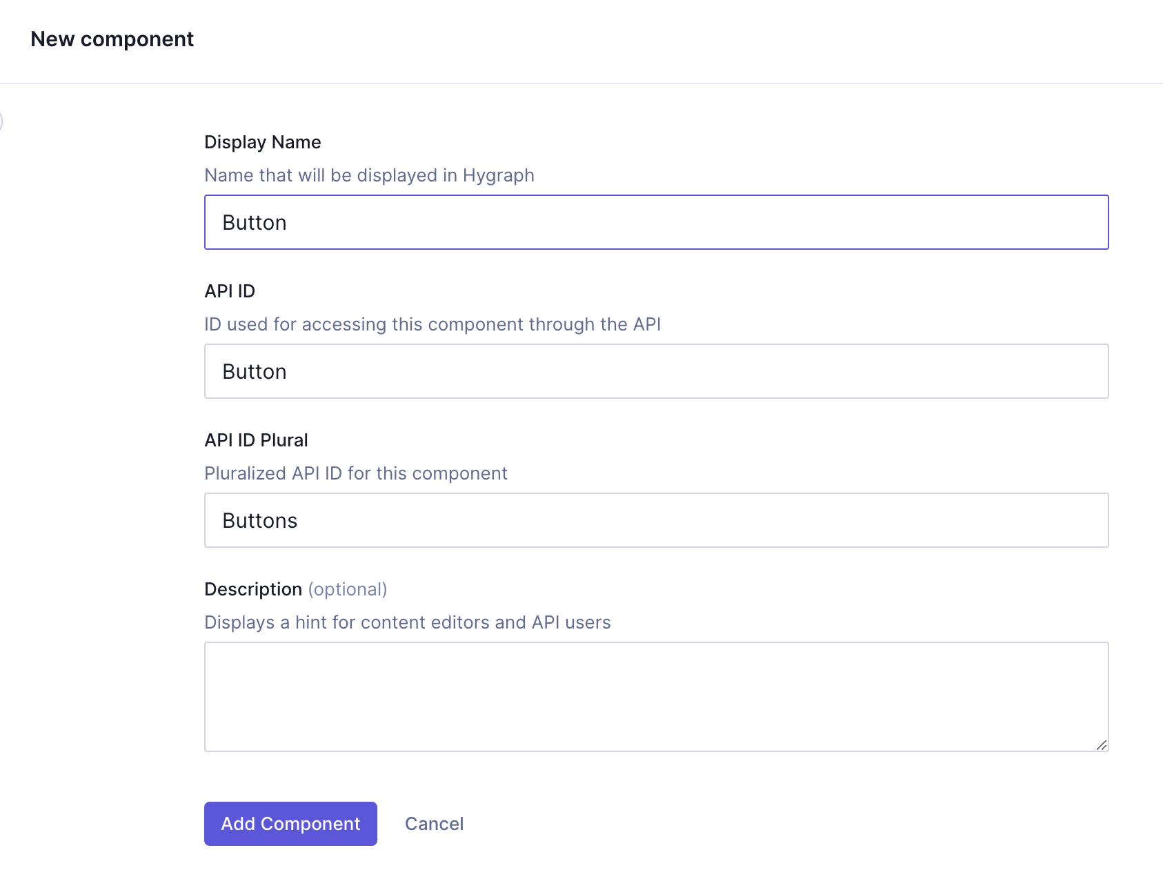
We'll use the following information to create the component itself:
| Field | Input |
| ------------- | ------- |
| Display Name | Button |
| API ID | Button |
| API ID Plural | Buttons |
We'll click `Add component` to save.
We can now start adding instances to this component.
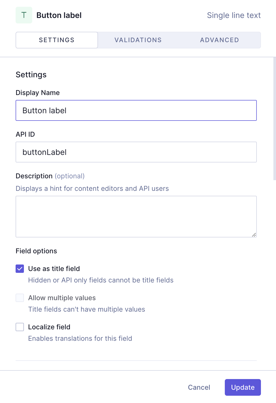
Let's start with a `Single line text` field, which will be the label of our button. We'll find it on the **Add fields** right sidebar, click on it, and use the following information:
| Tab | Field | Input |
| ----------- | ------------------------------ | ---------------------------- |
| Settings | Display Name | Button label |
| Settings | API ID | buttonLabel |
| Settings | `Use as title field` checkbox | Leave this checkbox selected |
| Validations | `Make field required` checkbox | Select this checkbox |
We'll click `Add` to save.
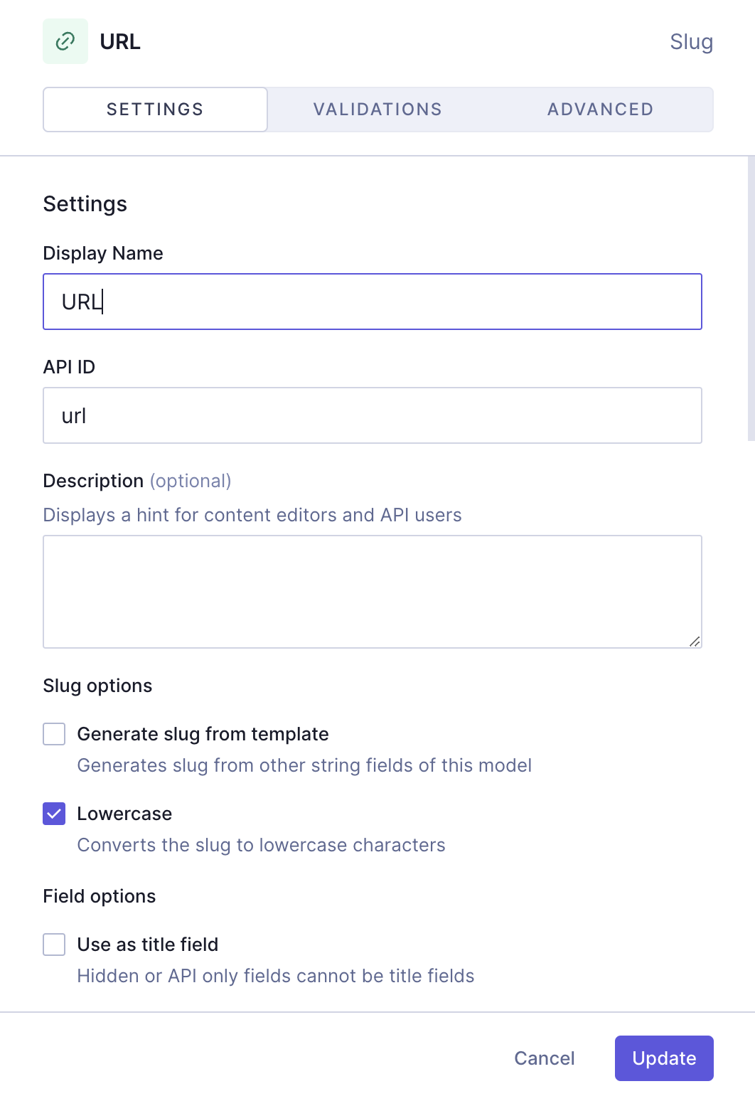
Let's also add a `Slug` field, which will be our link URL. We'll find it on the **Add fields** right sidebar, click on it, and use the following information:
| Tab | Field | Input |
| ----------- | ----------------------------------- | ---------------------------------------------------------------------------------------------------------------------------------------------------------------------------- |
| Settings | Display Name | URL |
| Settings | API ID | url |
| Settings | `Lowercase` checkbox | Leave this checkbox selected |
| Validations | `Make field required` checkbox | Select this checkbox |
| Validations | `Set field as unique` checkbox | Leave this checkbox selected |
| Validations | `Match a specific pattern` checkbox | Leave this checkbox selected, and use the dropdown to select the `URL` pattern. Write "Input value does not match the expected format." in the `Custom error message` field. |
We'll click `Add` to save.
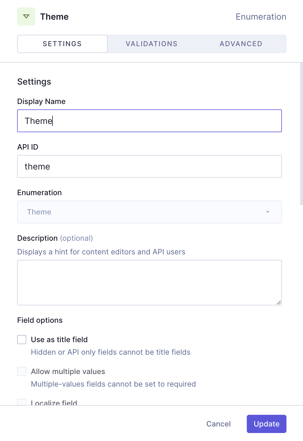
Finally, we'll add an `Enumeration` field for the button themes, which will be one of our dropdown menus. We'll find it on the **Add fields** right sidebar, click on it, and use the following information:
| Tab | Field | Input |
| ----------- | ------------------------------ | ------------------------------------- |
| Settings | Display Name | Theme |
| Settings | API ID | theme |
| Settings | Enumeration | Select "Theme" from the dropdown menu |
| Validations | `Make field required` checkbox | Select this checkbox |
We'll click `Add` to save.
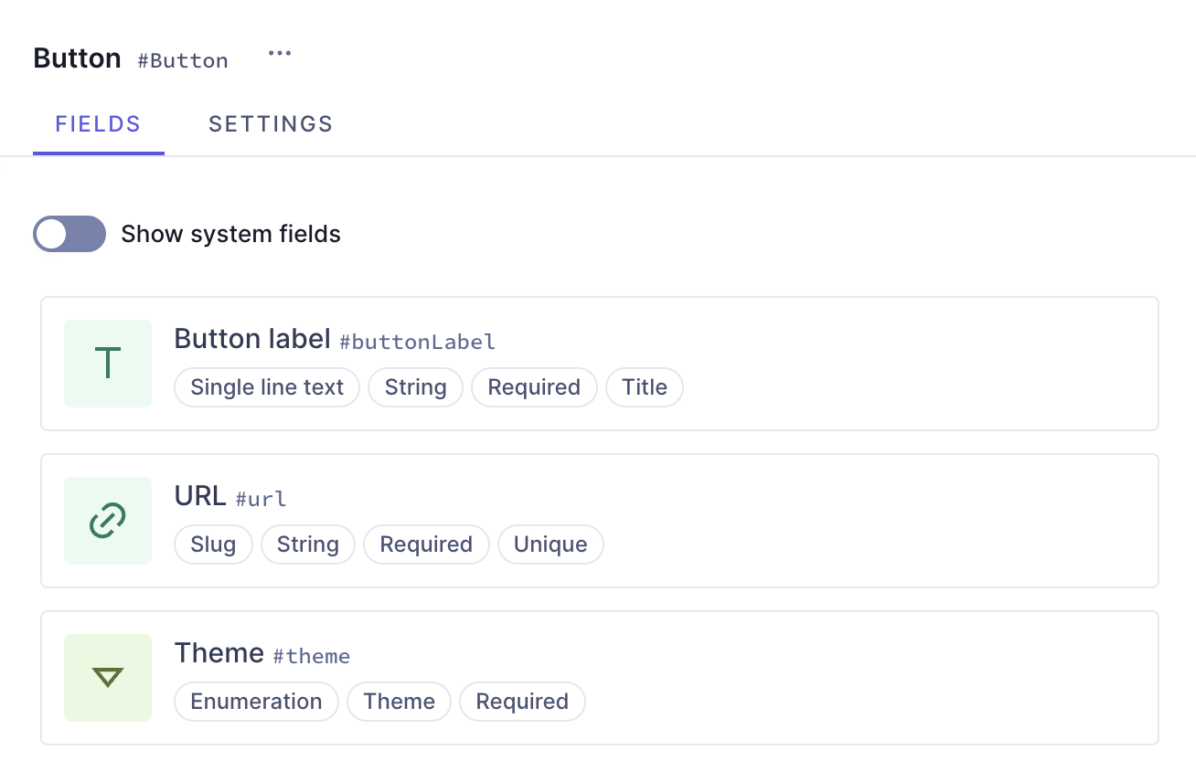
Our button component should look like this:
### 4. Create the card type components
We need to create cards so we can add them to our card grid. In this example, we will create two card types showing two typical card schema element combinations. Each card type is a component, which we will later on add to our grid.
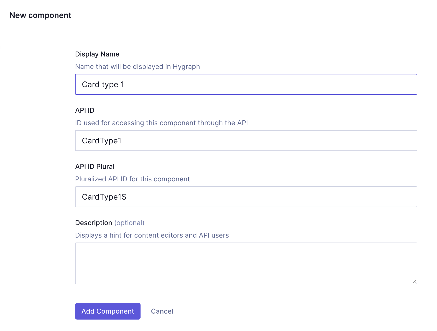
To create the first card type, we'll click `+Add` next to **Components** and use the following information:
| Field | Input |
| ------------- | ----------- |
| Display Name | Card type 1 |
| API ID | CardType1 |
| API ID Plural | CardType1S |
We'll click `Add component` to save.
We can now start adding instances to this component.
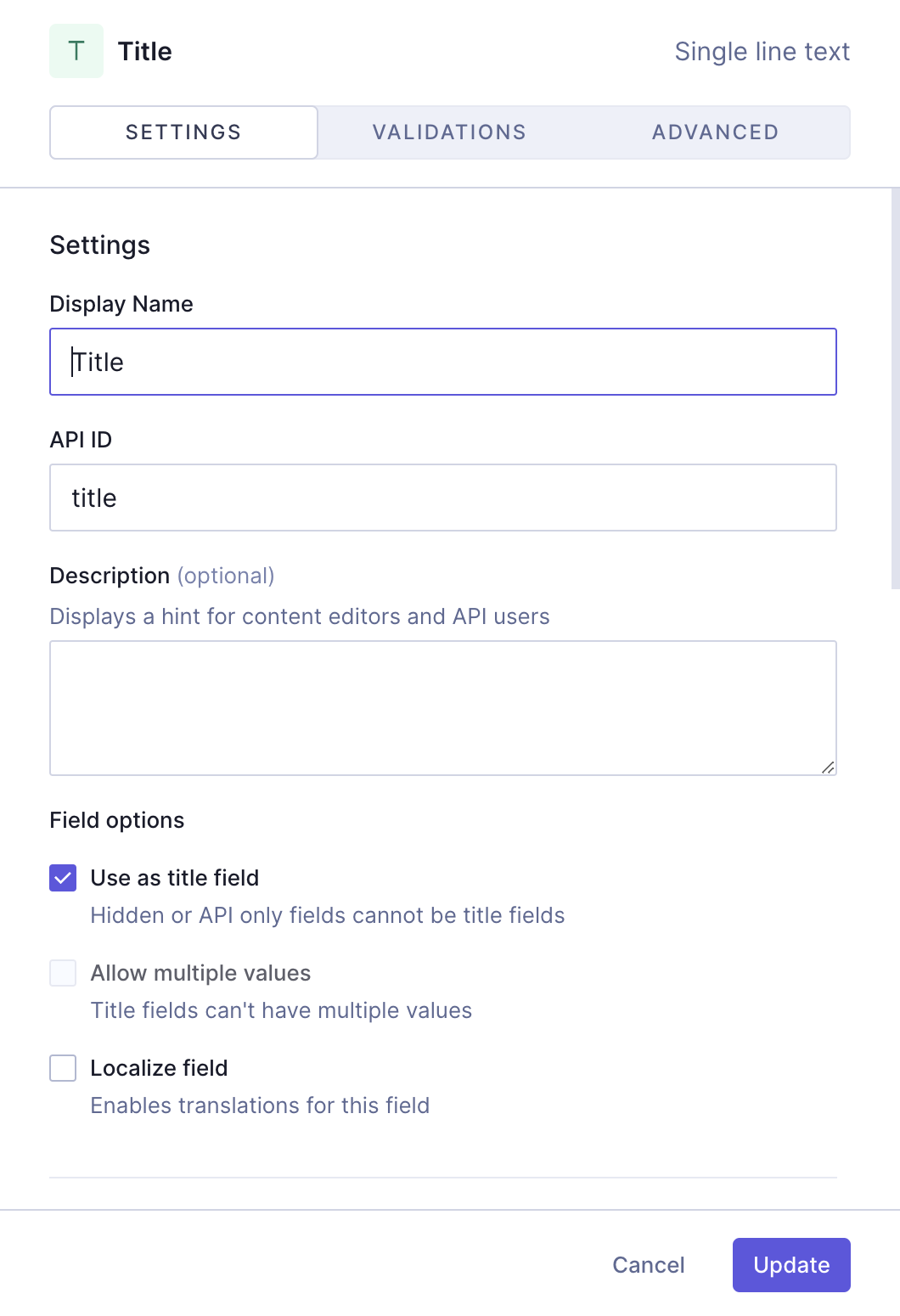
Let's start with a `Single line text` field, which will be the title of our card. We'll find it on the **Add fields** right sidebar, click on it, and use the following information:
| Tab | Field | Input |
| ----------- | ------------------------------ | ---------------------------- |
| Settings | Display Name | Title |
| Settings | API ID | title |
| Settings | `Use as title field` checkbox | Leave this checkbox selected |
| Validations | `Make field required` checkbox | Select this checkbox |
We'll click `Add` to save.
Next, we'll add a `Rich text` field, which will be the body of our card. We'll select the `Rich text` field from the right sidebar and use the following information to create it:
| Tab | Field | Input |
| -------- | ------------ | ----- |
| Settings | Display Name | Body |
| Settings | API ID | body |
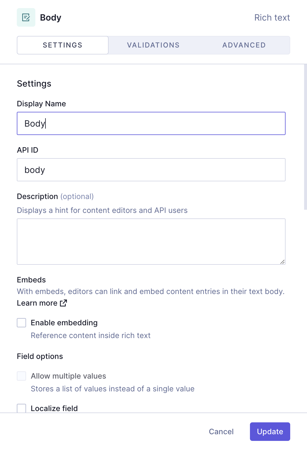
We'll click `Add` to save.
The next thing we want to add here is the link component we created earlier, so our card can contain a link.
We'll select the `Basic component` field from the right sidebar and use the following information to create it:
| Tab | Field | Input |
| -------- | -------------------------------- | ------------------------------------------------------------------------------------------ |
| Settings | Display Name | Link |
| Settings | API ID | link |
| Settings | `Allow multiple values` checkbox | Select this checkbox. This will allow you to later on add more than one link to your card. |
| Settings | `Select component` dropdown menu | Select the **"Link"** component |
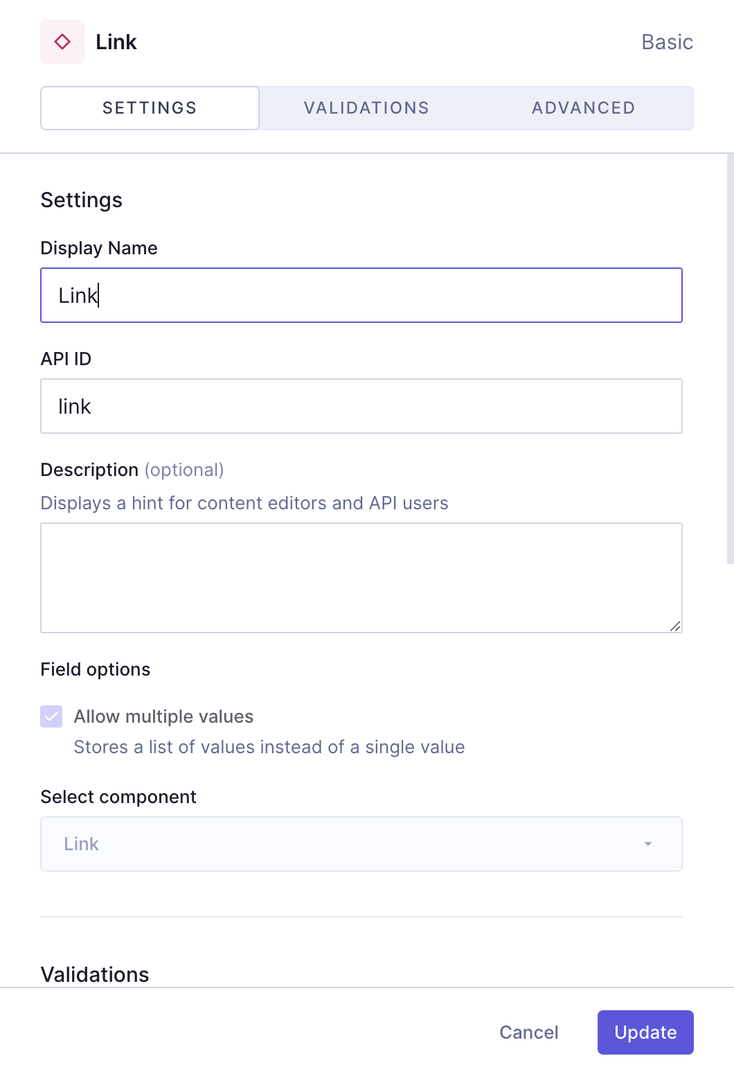
We'll click `Add` to save.
Next, we'll add an `Enumeration` field, which will be one of our dropdown menus. Once again, we'll find it on the **Add fields** right sidebar, click on it, and use the following information:
| Tab | Field | Input |
| ----------- | ------------------------------ | ------------------------------------- |
| Settings | Display Name | Theme |
| Settings | API ID | theme |
| Settings | Enumeration | Select "Theme" from the dropdown menu |
| Validations | `Make field required` checkbox | Select this checkbox |
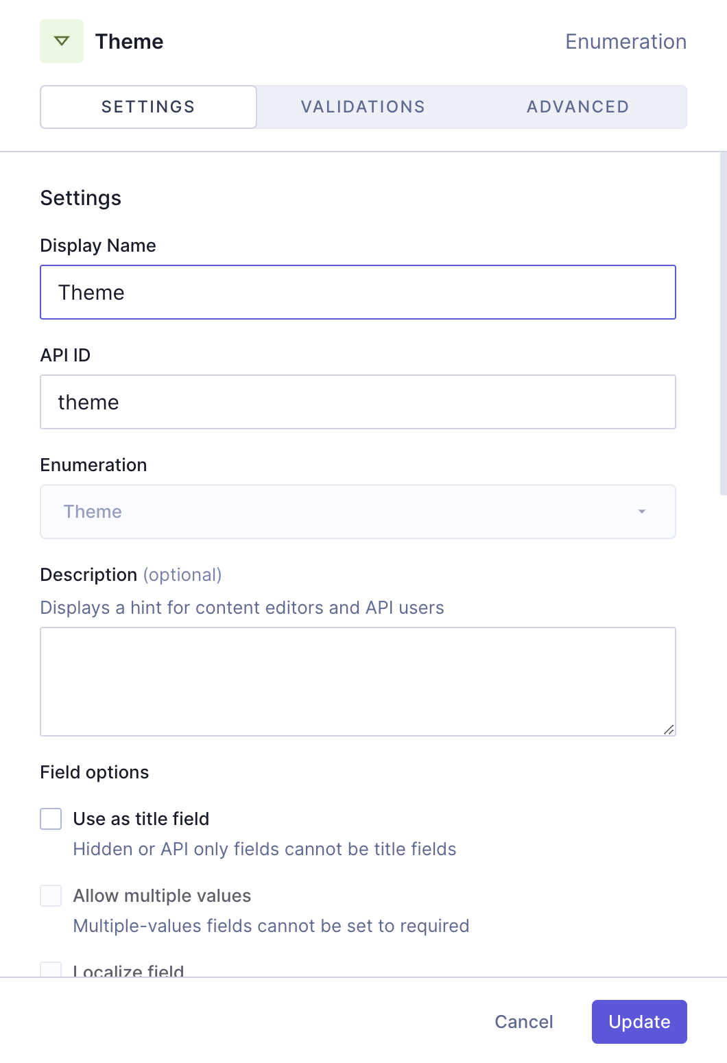
We'll click `Add` to save.
Finally, we'll add one more `Enumeration` field, for the padding options:
| Tab | Field | Input |
| ----------- | ------------------------------ | --------------------------------------- |
| Settings | Display Name | Padding |
| Settings | API ID | padding |
| Settings | Enumeration | Select "Padding" from the dropdown menu |
| Validations | `Make field required` checkbox | Select this checkbox |
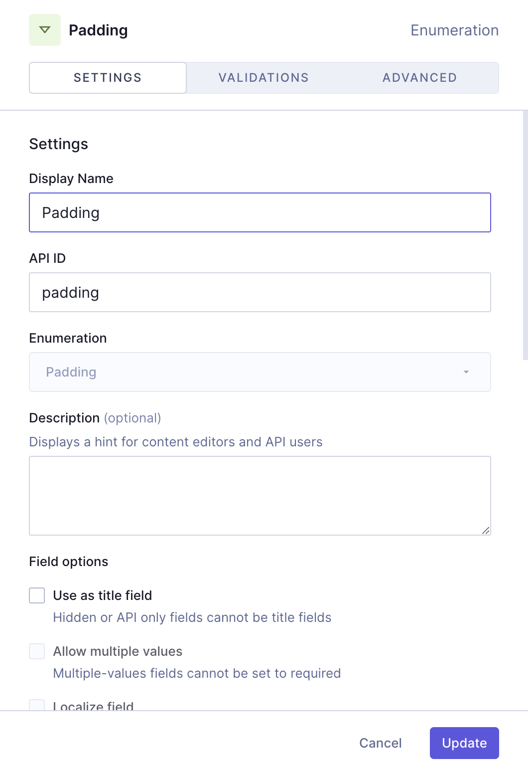
We'll click `Add` to save.
Our "Card type 1" component should look like this:
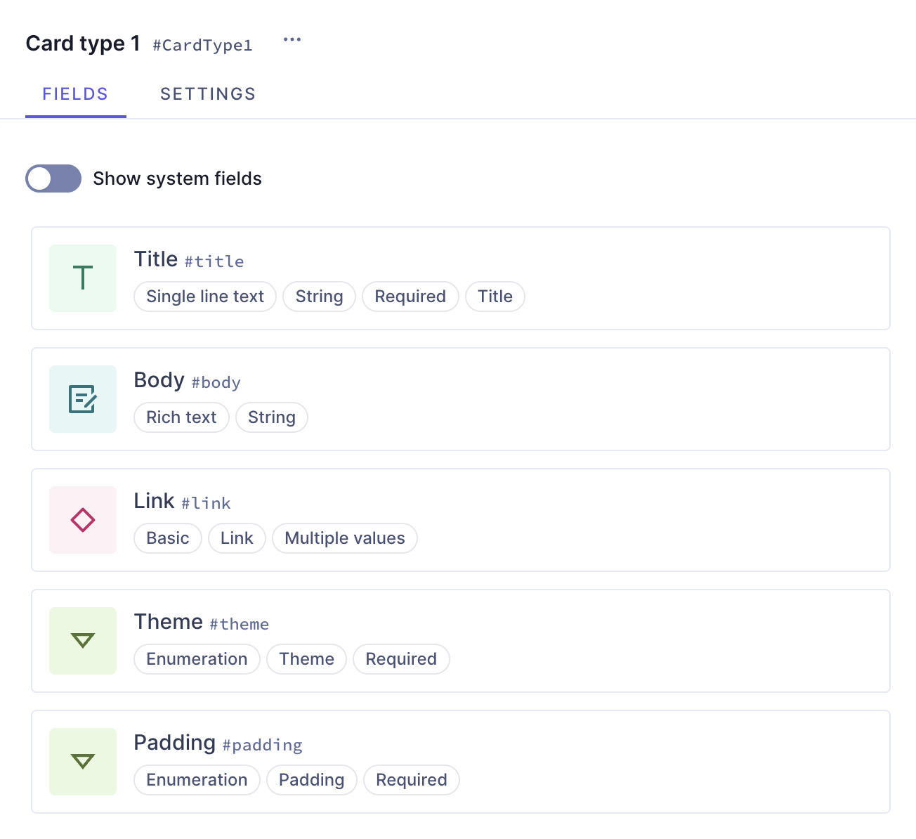
We now have our first card type ready! It contains a title, a body, a link component, and two enumerations that will let us select theme and padding options.
Let's now create our second card type component. We'll start by clicking `+Add` next to **Components** and repeating the process using this information:
| Field | Input |
| ------------- | ----------- |
| Display Name | Card type 2 |
| API ID | CardType2 |
| API ID Plural | CardType2S |
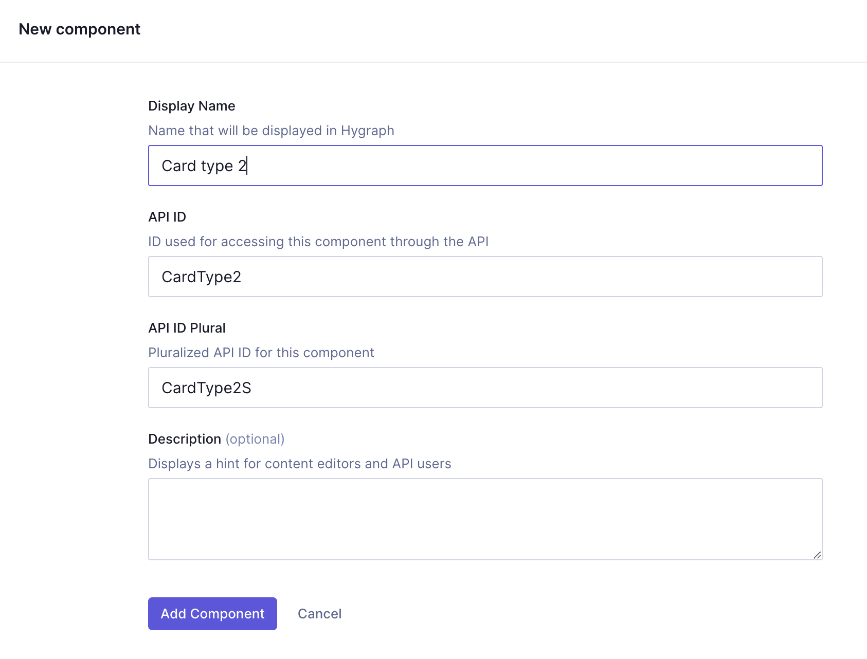
We'll click `Add component` to save.
We can now start adding instances to this component.
Let's start with a `Single line text` field, which will be the title of our card. We'll find it on the **Add fields** right sidebar, click on it, and use the following information:
| Tab | Field | Input |
| ----------- | ------------------------------ | ---------------------------- |
| Settings | Display Name | Title |
| Settings | API ID | title |
| Settings | `Use as title field` checkbox | Leave this checkbox selected |
| Validations | `Make field required` checkbox | Select this checkbox |
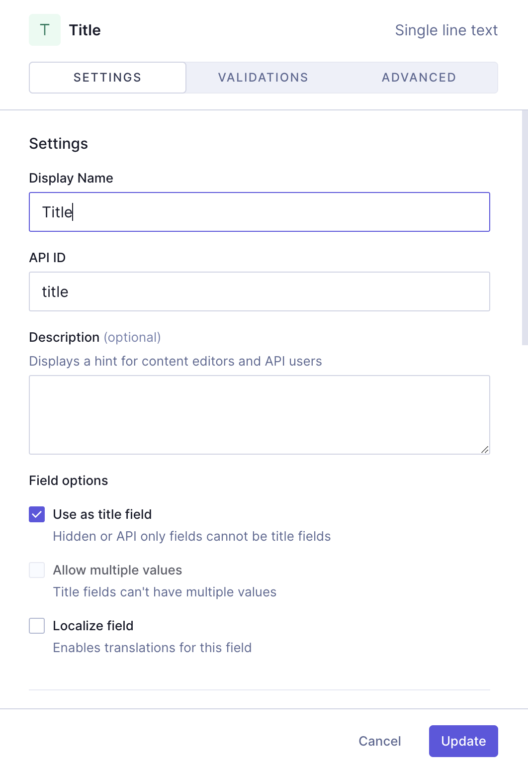
We'll click `Add` to save.
Next, we'll add a `Rich text` field, which will be the body of our card. We'll select the `Rich text` field from the right sidebar and use the following information to create it:
| Tab | Field | Input |
| ----------- | ------------------------------ | -------------------- |
| Settings | Display Name | Body |
| Settings | API ID | body |
| Validations | `Make field required` checkbox | Select this checkbox |
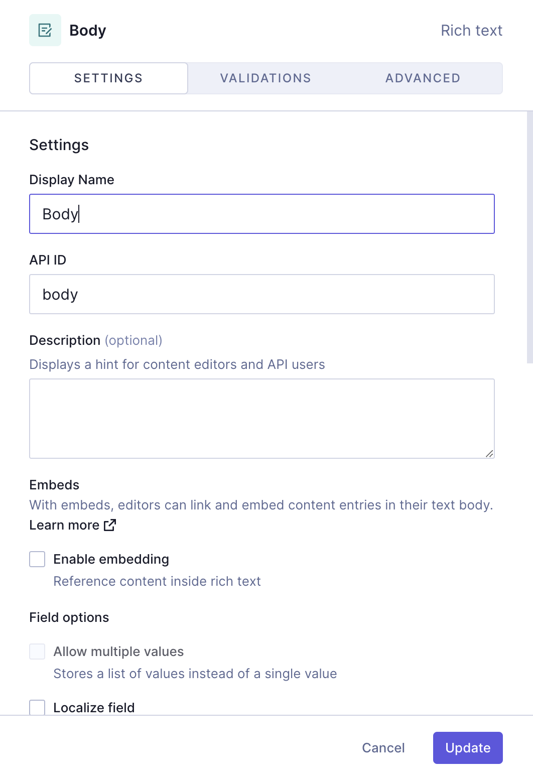
We'll click `Add` to save.
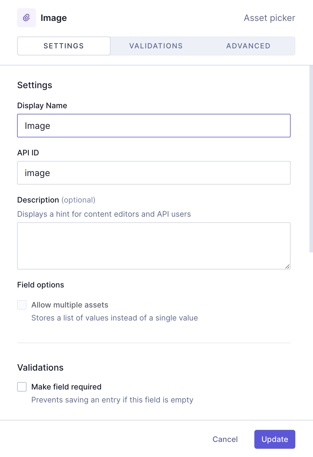
Next, we'll add an `Asset picker` field, so we can later add an image to our card. We'll select the `Asset picker` field from the right sidebar and use the following information to create it:
| Tab | Field | Input |
| -------- | ------------ | ----- |
| Settings | Display Name | Image |
| Settings | API ID | image |
We'll click `Add` to save.
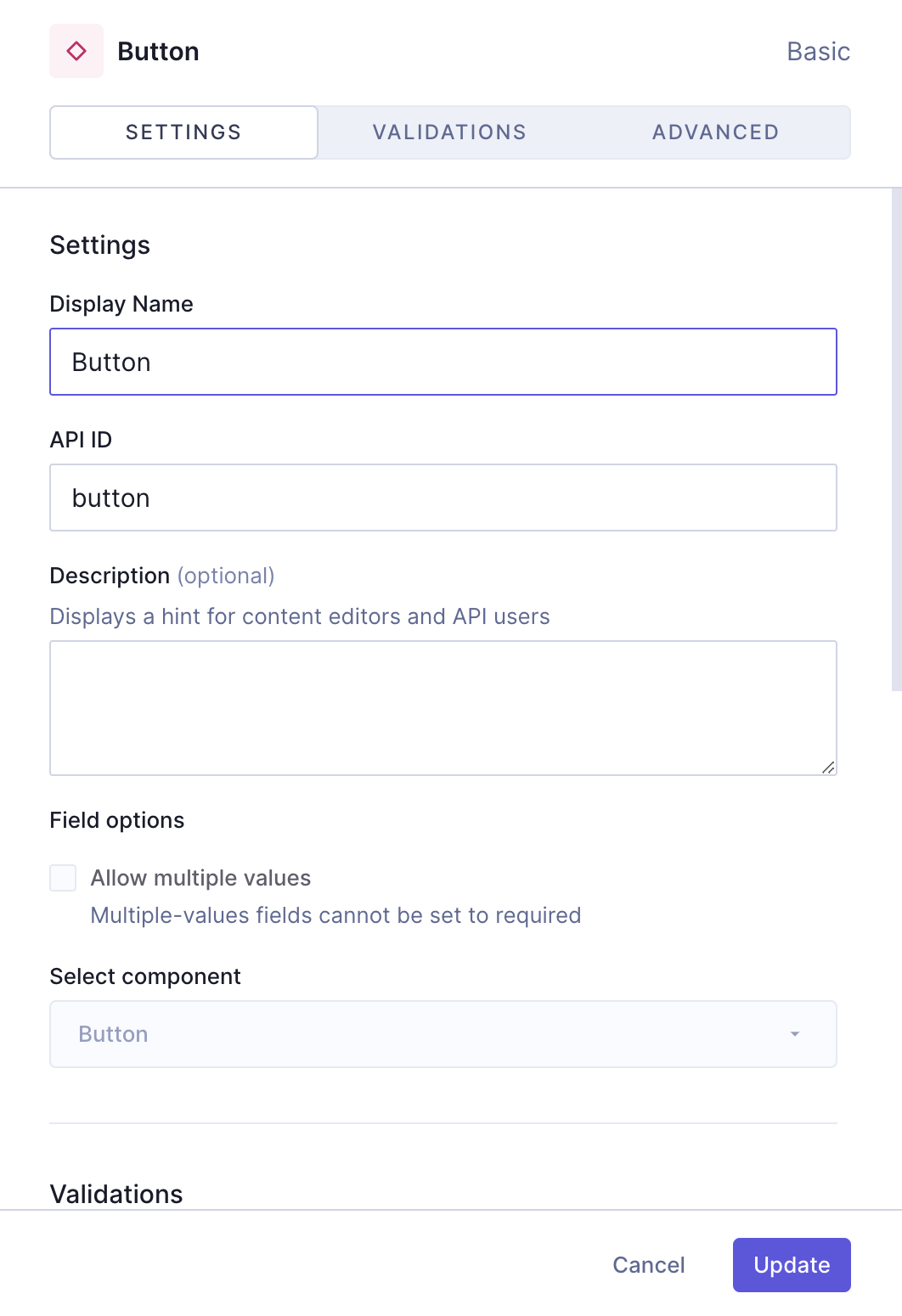
The next thing we want to add here is the button component we created earlier. We'll select the `Basic component` field from the right sidebar and use the following information to create it:
| Tab | Field | Input |
| ----------- | -------------------------------- | --------------------------------- |
| Settings | Display Name | Button |
| Settings | API ID | button |
| Settings | `Select component` dropdown menu | Select the **"Button"** component |
| Validations | `Make field required` checkbox | Select this checkbox |
We'll click `Add` to save.
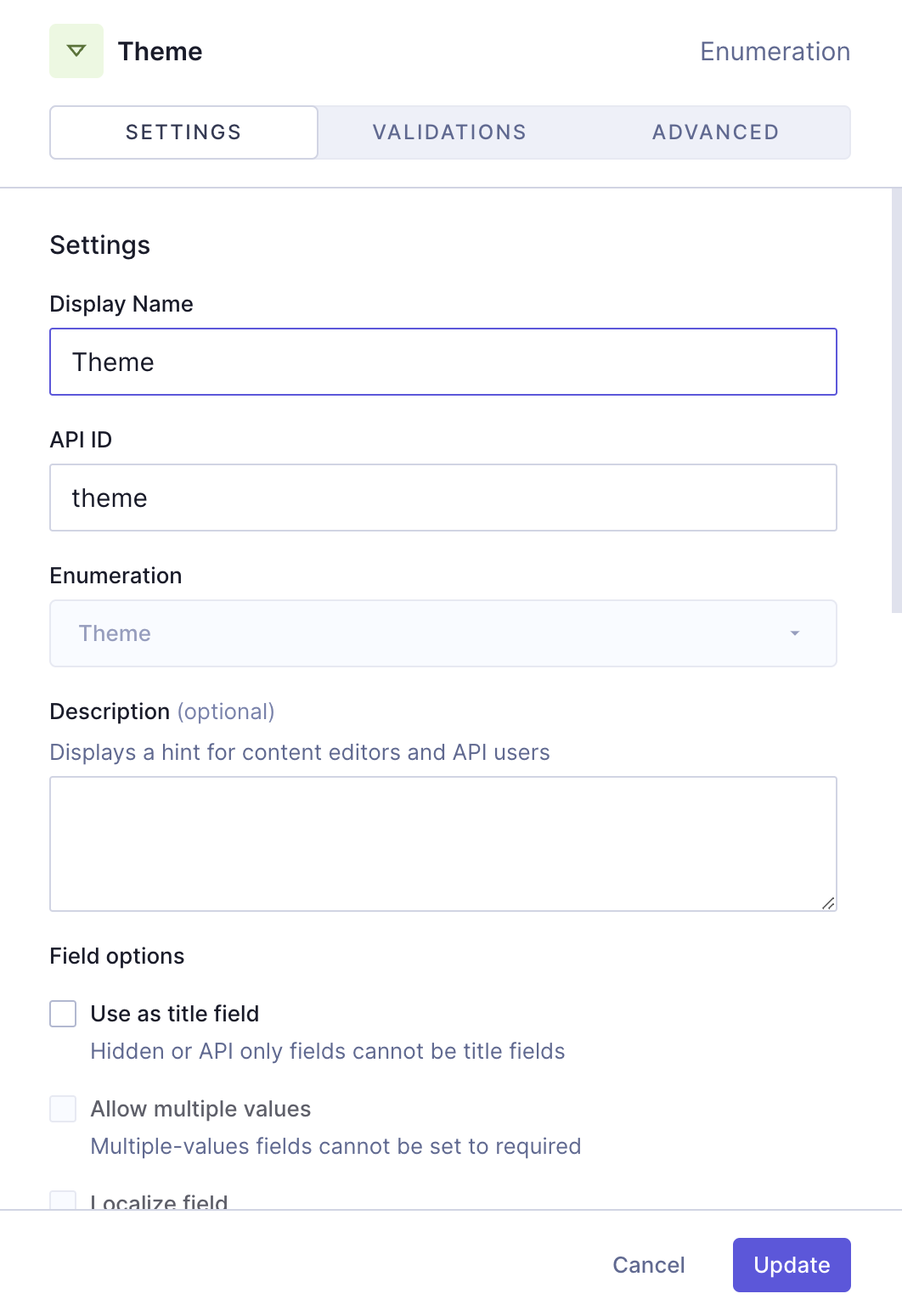
Next, we'll add an `Enumeration` field, which will be one of our dropdown menus. Once again, we'll find it on the **Add fields** right sidebar, click on it, and use the following information:
| Tab | Field | Input |
| ----------- | ------------------------------ | ------------------------------------- |
| Settings | Display Name | Theme |
| Settings | API ID | theme |
| Settings | Enumeration | Select "Theme" from the dropdown menu |
| Validations | `Make field required` checkbox | Select this checkbox |
We'll click `Add` to save.
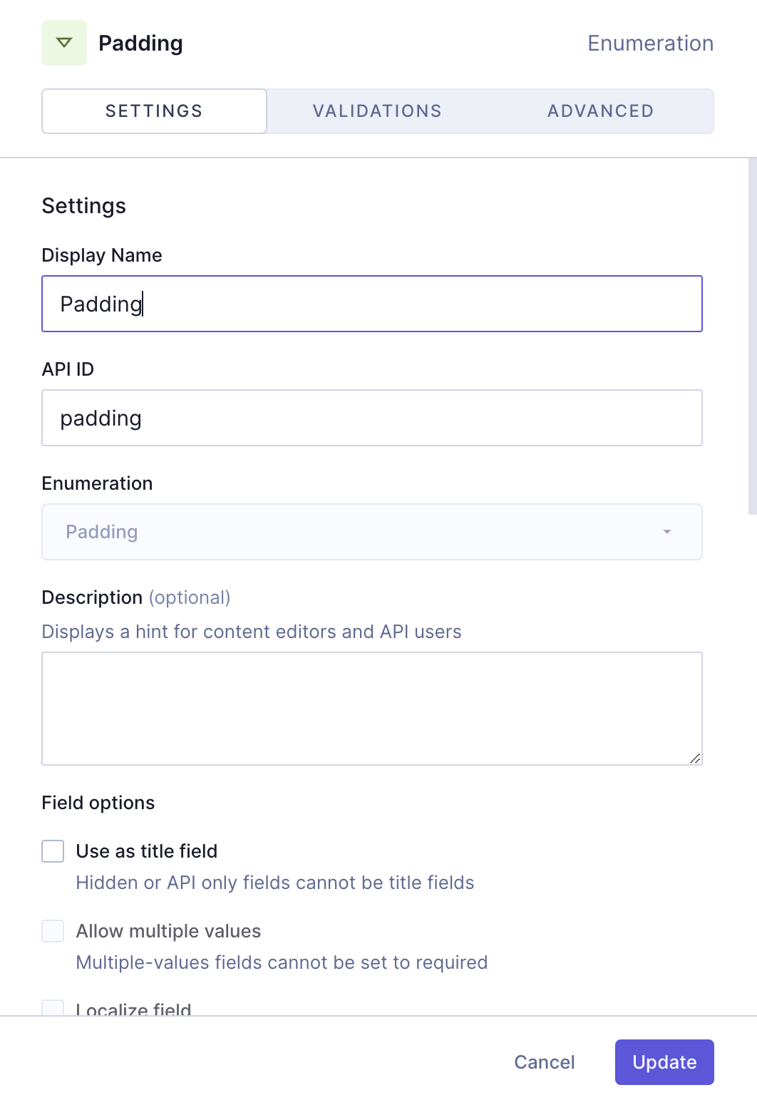
Finally, we'll add one more `Enumeration` field, for the padding options:
| Tab | Field | Input |
| ----------- | ------------------------------ | --------------------------------------- |
| Settings | Display Name | Padding |
| Settings | API ID | padding |
| Settings | Enumeration | Select "Padding" from the dropdown menu |
| Validations | `Make field required` checkbox | Select this checkbox |
We'll click `Add` to save.
Our "Card Type 2" component should look like this:
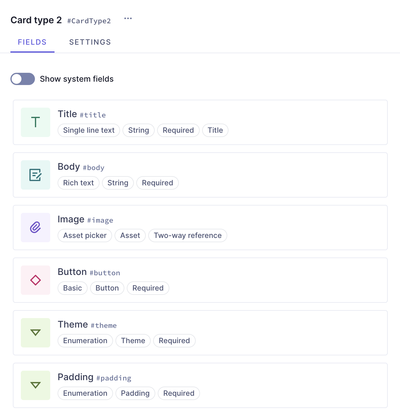
We now have our second card type ready! It contains a title, a body, a button component, an asset picker to add images, and two enumerations that will let us select theme and padding options.
### 5. Create the card grid
At this point, we've created everything we need in order to start working on our card grid component. We'll create a new component using this information:
| Field | Input |
| ------------- | ---------------------- |
| Display Name | Card Grid - Components |
| API ID | CardGridComponents |
| API ID Plural | CardGridComponentss |
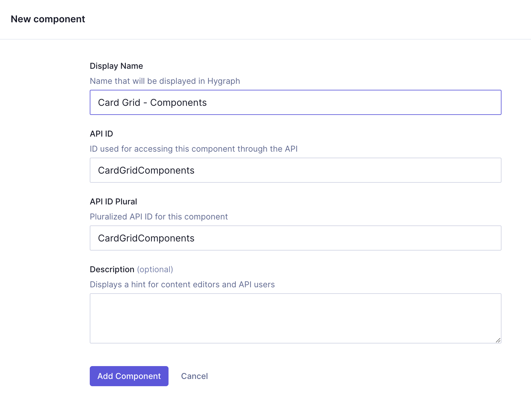
We'll click `Add component` to save.
We can now start adding instances to this component.
Let's start with a `Number` field, which we can later use to indicate the number of columns that our grid should have.
We'll find it on the **Add fields** right sidebar, click on it, and use the following information:
| Tab | Field | Input |
| ----------- | ------------------------------ | -------------------- |
| Settings | Display Name | Columns |
| Settings | API ID | columns |
| Validations | `Make field required` checkbox | Select this checkbox |
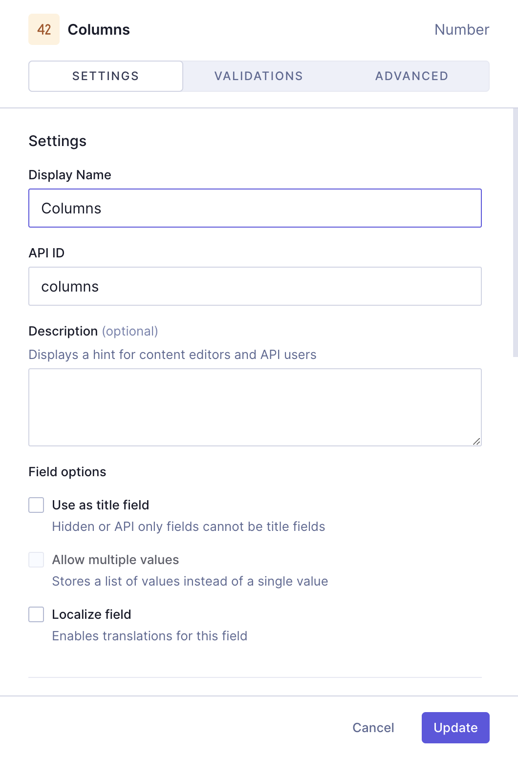
We'll click `Add` to save.
Earlier, we created two card types. We will now add them as part of a `Modular component` field so when we use the card grid component, we will be able to select which card type to use in it.
We'll find the `Modular component` field on the **Add fields** right sidebar, click on it, and use the following information:
| Tab | Field | Input |
| -------- | -------------------------------- | ------------------------------------------------------------------------- |
| Settings | Display Name | Card types |
| Settings | API ID | cardTypes |
| Settings | `Allow multiple values` checkbox | Select this checkbox |
| Settings | Select allowed components | Use the dropdown to select the "Card type 1" and "Card type 2" components |
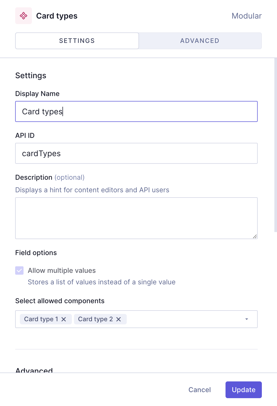
We'll click `Add` to save.
**Note:**
In the case of this modular component field, we will allow multiple values because without that we'd only be able to add a single card to our grid.
The final step will be to add an `Enumeration` field so we can later select the gap size between cards. We'll use the following information to create it:
| Tab | Field | Input |
| -------- | ------------ | ----------------------------------------- |
| Settings | Display Name | Cards gap |
| Settings | API ID | cardsGap |
| Settings | Enumeration | Select "Cards gap" from the dropdown menu |
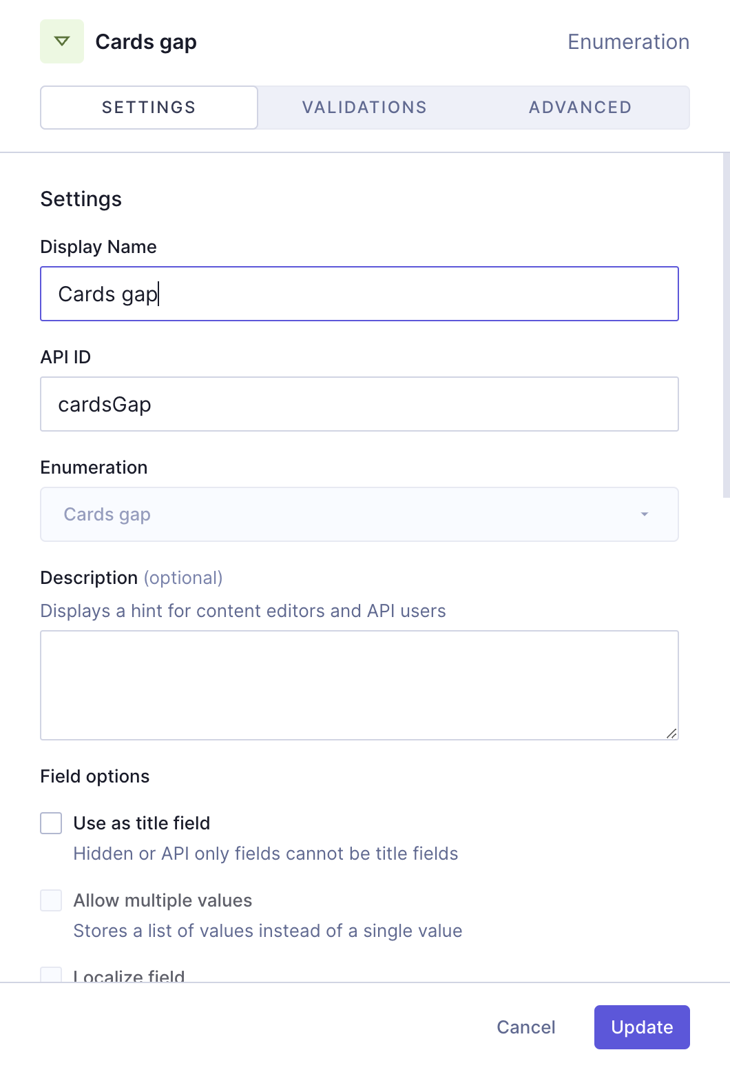
We'll click `Add` to save.
We've created a card grid component that contains several other components nested in it at different levels, as well as other schema elements.

**Pro Tip:**
This step-by-step guide is a good example of why it is important to plan our content schema. Our objective was to create a card grid component, but before we could create that we needed to create a lot of other elements that would be a part of it.
This guide helped you create the schema element yourself. Alternatively, you can clone a project containing all our card grid recipes.
Check out the next document section for that!
## Useful links
- [Enumerations](https://hygraph.com/classic-docs/developer-guides/schema/using-enumerations)
- [Components documentation](https://hygraph.com/classic-docs/developer-guides/schema/components)
**Would you like to know more?:**
We have more resources for you!
[Learn how to create a card grid component that adds content entries in your project as cards!](https://hygraph.com/classic-docs/recipes/card-grid/card-grid-references/)
**Do you have suggestions?:**
Join our community to suggest new recipe ideas!