#Components
#Overview
A component is a predefined set of fields that can be reused across models and content entries. You can think of a component as a flexible, reusable template where you define the fields that will be used inside a component once, and then fill them with different content every time you use it in a content entry.
#What you can do
You can create components as templates to reuse in your schema. This saves time and declutters your content creation screen.
Components don't currently support remote sources, as well as embedding for the Rich Text editor.
#Important concepts
-
Component: a predefined set of fields that can be reused across models and content entries. You can think of a component as a flexible, reusable template: you define the fields that will be used inside a component once, and then fill them with different content every time you use it in a content entry.
-
Component instance: a specific occurrence of the component type, containing content, inside a content entry. While there is no limit to the number of component instances that you can add to a component field yet, you will only be able to see the first 50 in the UI.
-
Component field: a special field type in your Hygraph schema that defines which components of which type can be used in a model. Component fields can be of basic or modular types.
-
Basic component field: a basic component field can only have one component attached to it. You can limit the number of component instances to one, or allow multiple component instances to be added in the content entry.
-
Modular component field: a modular component field can have two or more components attached to it.
Both Basic and Modular component fields can be configured to allow multiple values. If multiple values are allowed for a component field, this field will allow for multiple component instances to be added to a content entry.
-
-
Nested components: functionality that allows you to create components within a component, as if you had a parent component containing one or more child components.
#Adding a component to your model
The process of adding a component to your model involves two major steps: creating a component and adding it to your model using a component field.
#Creating a component
-
Navigate to the Schema Builder.
-
In the left sidebar, find the Components section below your Models and click on
+Add. -
Add the name of your component in the
Display namefield, theAPI IDandPlural API IDwill be auto-filled by the system. -
Click on
Create component. -
Add different fields to your component. For example, we can create an Address component for our Organization model. For that, we will add single-line text fields for the Address lines and City, as well as a number field for ZIP code.
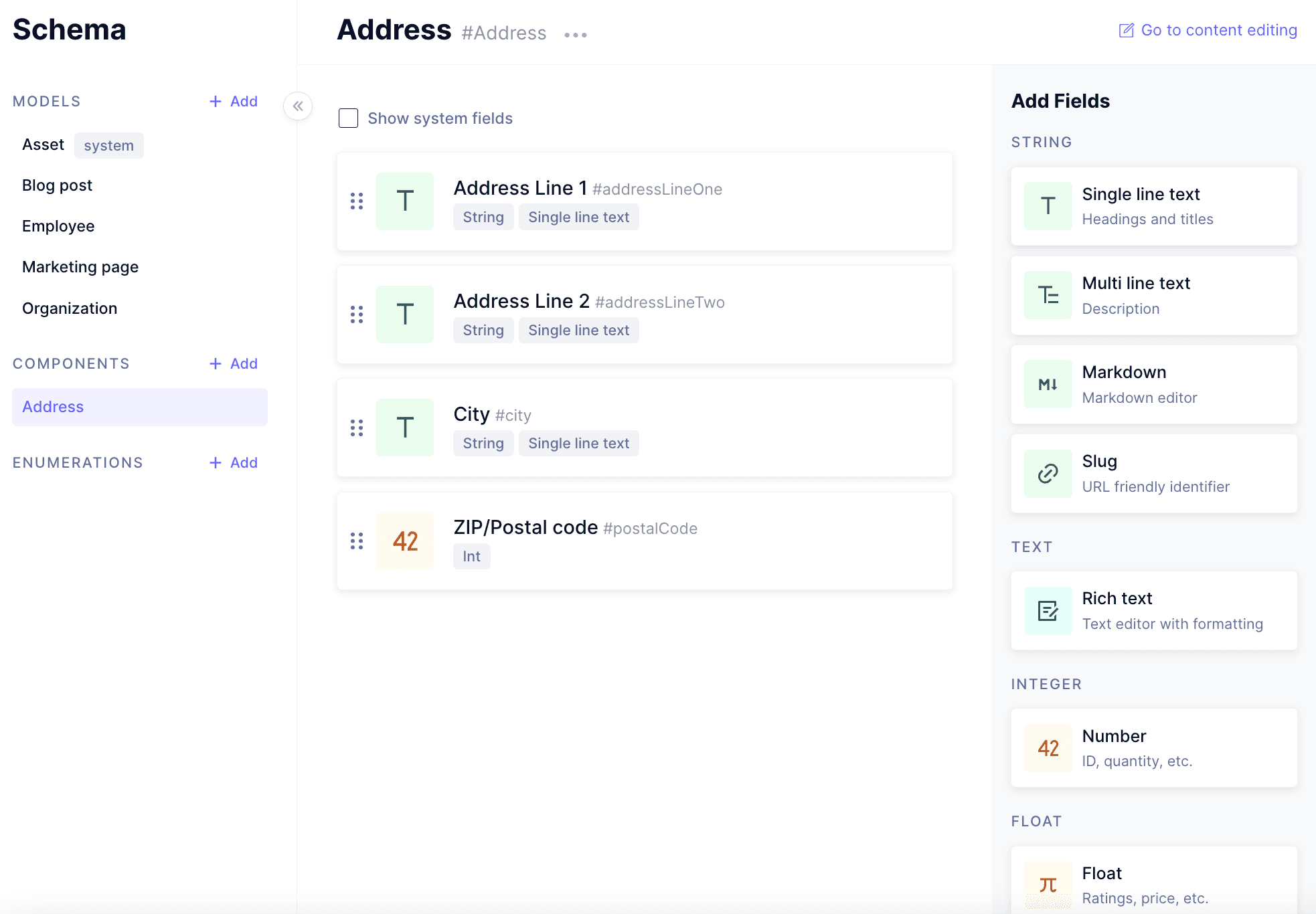 Creating a component
Keep in mind the number of components is based on your project's current plan. Click here to find out more about our pricing.
While there is no limit to the number of component instances that you can add to a component field yet, you will only be able to see the first 50 in the UI. Beyond those first 50, they are fully queryable through the API Playground, but you won't be able to see them in the UI.
#Adding a component field to your model
-
Navigate to the Schema builder, and then to the model you wish to add your component to.
-
Select a Basic component field or a Modular component field from the Add fields right sidebar. You can learn about the differences between them here.
-
Add the name of your component field in the
Display namefield, theAPI IDwill be auto-filled by the system. Optionally, you can also add aDescription. This screen allows you to control different properties of your component field: you can allow multiple component instances to be added by allowing multiple values, or you can make this field required in the Advanced section. -
Use the dropdown at the bottom of the screen to pick the component - or several components - that you wish to have in your component field. This dropdown will be named
Select componentif you're creating a basic component field, orSelect allowed componentsif you're creating a modular component field.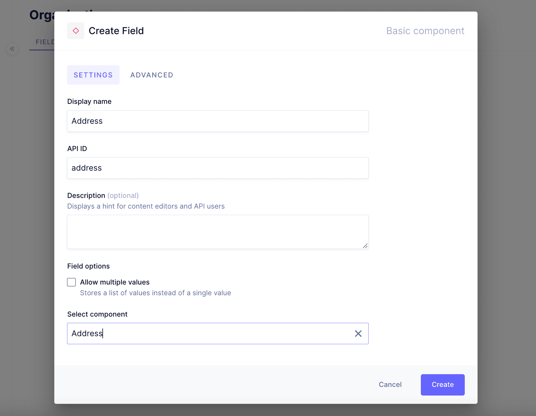 Adding a component field to your model
 -
Click on the
Createbutton.
#Using a component in a content entry
-
After adding a component to your model, navigate to the content editing section to test your new or updated model.
-
Click on the
+ Create itembutton. -
You will be able to see your component field in the content entry.
-
If it's a basic component field, click the
+Add componentbutton, if it's a modular component field, select a component from the drop-down menu.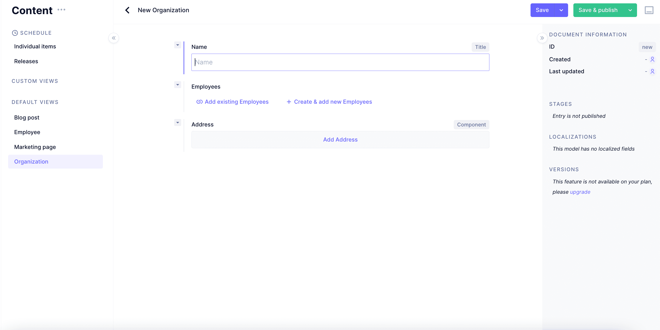 Add a new component to an entry
 -
You've just created your first component instance! Now it's time to add some content to this instance.
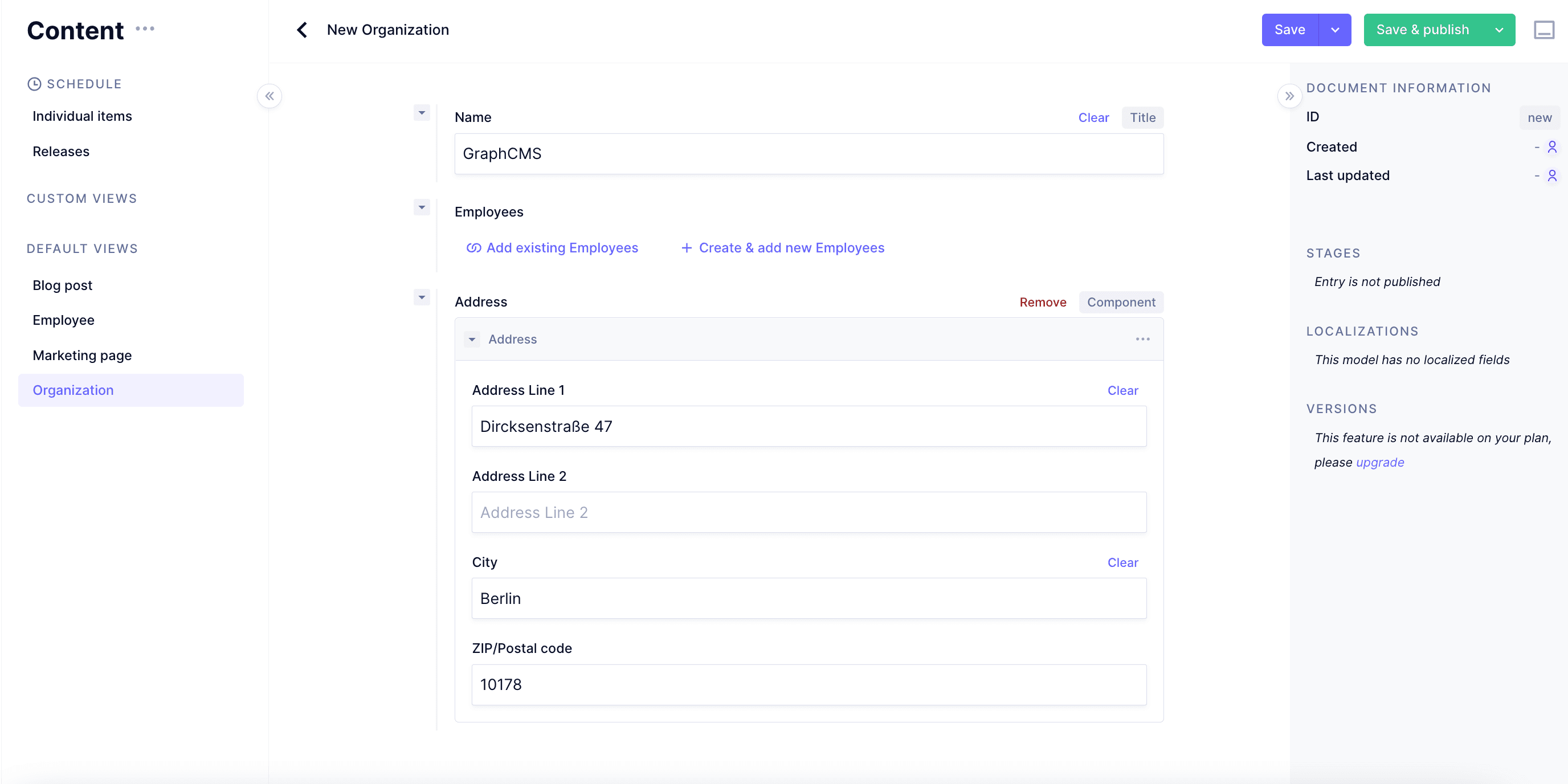 Add content on a component
 -
If you previously selected
Allow multiple valueson your component field's parameters, you will be able to add a different component instance by using the+Add another componentbutton at the bottom of your component field, or by using the•••sub-menu and selectingAdd component beloworAdd component above. Add multiple component instances
 -
You can also remove and reorder your component instances using the
•••sub-menu or the arrows next to it. Remove or reorder component instances
#Nested components
The nested components functionality enhances how you can reuse and edit your models by allowing you to add component fields to a component.
Using nested components you can have a parent component where one or more child components are nested. This would allow you to, for instance, create a section and a subsection component, and then embed one into the other.
#How to use nested components
-
Create your components, or use the ones you've already created.
-
Add either a basic or modular component field to the component you wish to add the nested component to. You will find them on the Add fields right sidebar.
Keep in mind that, when you add a component field, the options offered when selecting the nested components are other components already created. So make sure you have created the components you need before doing this.
-
Fill in the required information in the Create field screen in the same way you did for step 3 of the Adding a component field to your model process.
-
Select the component you wish to nest into the current one from the
Select componentsdropdown at the bottom of the screen if it's a basic component field, or theSelect allowed componentsdropdown if it's a modular component field.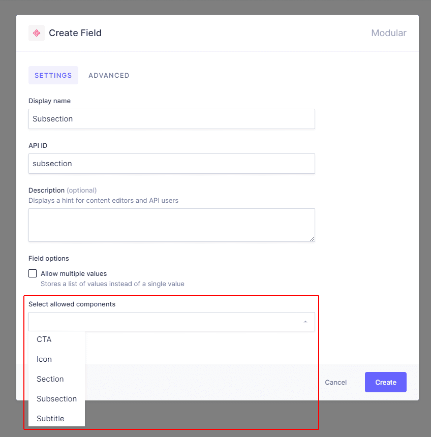 Select nested components
 -
Click on the
Createbutton.
As a result, your new nested component field is now displayed on the fields list of the parent component.
Finally, you can go to the Content editing section and create a new entry, where you will have the option of adding the newly created nested component as a subsection of the component you added it to.
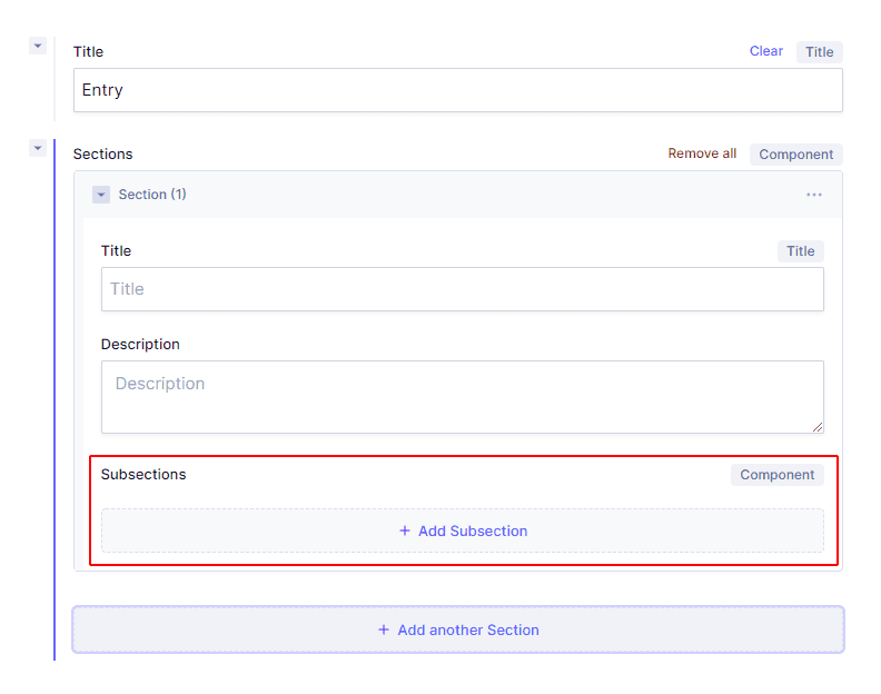 Add nested components
Keep in mind that the maximum level of nesting is 4.
#Querying components
After a component field has been configured, it's added to the Hygraph schema and becomes immediately queryable through the API. Press CTRL+Space or open the Explorer view to see the available fields inside the model that contains a component field.
Basic component fields are queried in the same way, as you would query regular fields inside your models. In the example below, a user has a page model with a basic hero component field that has cta, description and heroImage fields. Here's an example of a query with this setup:
query basicComponent {pages {idtitlemainTexthero {#note that in the case of basic components, we're only using the component field's API ID, and we don't need to use the API ID of the component itselfctadecriptionheroImage {urlheightwidth}}}}
The query above will return a result like this:
{"data": {"pages": [{"id": "cl120a7gvu57b0bt3qw4xiv86","title": "Open positions at Hygraph","mainText": "Follow this link to see all of the open positions - https://jobs.hygraph.com/","hero": [{"cta": "Explore vacancies!","description": "There are a huge variety of positions to be filled now","heroImage": {"url": "https://media.graphassets.com/OIi5LuhxTTOm1M2bDS9N","height": 480,"width": 640}},{"cta": "Apply right now!","description": "The application process is nice and smooth","heroImage": {"url": "https://media.graphassets.com/bAEFpGV2S2WxiuzYcV6R","height": 427,"width": 640}}]}]}}
Modular component fields are union types “under the hood”, so querying works the same way as with relations and unions. In the example below, a user has a blogPost model with some regular fields, such as id, title and mainText, as well as the modular additionalSections component field. The modular component field has two different components: Contributor and VideoBlock. To query the two components inside the modular component field, we're going to use ... on Contributor and ... on VideoBlock, as we would do with a regular union type:
query modularComponent {blogPost(where: { id: "cl11z0rctt6g80bt3anxt7c11" }) {idtitlemainText {markdown}categories {categoryName}additionalSections {__typename # if you have multiple component instances, it's recommended to use __typename to know which fields belong to which component instance.... on Contributor {idnamejobTitle}... on VideoBlock {idtitledescriptionyouTubeEmbedUrlautoplay}}}}
This query will return something like this:
{"data": {"blogPost": {"id": "cl11z0rctt6g80bt3anxt7c11","title": "Berlin in spring","mainText": {"markdown": "The best time to visit the German capital is the end of April\n"},"categories": [{"categoryName": "General"}],"additionalSections": [{"__typename": "VideoBlock","id": "cl11z858dt6te0ftjxi5ucvwx","title": "Spring in Berlin","description": "Watch this video for some travelling inspiration","youTubeEmbedUrl": "<iframe width=\"560\" height=\"315\" src=\"https://www.youtube.com/embed/aWBGxt38o4s\" title=\"YouTube video player\" frameBorder=\"0\" allow=\"accelerometer; autoplay; clipboard-write; encrypted-media; gyroscope; picture-in-picture\" allowFullScreen></iframe>","autoplay": false},{"__typename": "Contributor","id": "cl11z0rdbt6g90bt3eud9anlj","name": "Daniil","jobTitle": "Editor"}]}}}
#How to decide between components and references?
Components are somewhat similar to references (relations) because in both cases something gets reused. The important difference is that in the case of components, only the set of fields without any content gets reused, whereas in the case of relations, already existing content entries get reused.
Let's use an example of an Author component. Authors can be attached to a content entry using either components or relations.
In the case of relations, you need to create your Authors first, in a separate model, and then reuse these content entries by attaching them to a post using the relation field. This works well if you have a small team of authors each of whom has their own Author profile.
In the case of components, you don't have to create Author entries before creating a Blog post content entry. However, every time you add an Author component instance to your post, you will need to fill in all of the fields from scratch. This works well if many different users can be the Authors of your content entries and it doesn’t make sense to create an Author profile for each of them.
For more information, check out our document on this subject.