#Styled image gallery
#Overview
Join our community to suggest new recipe ideas!
This guide shows how to build a simple image gallery with style dropdowns.
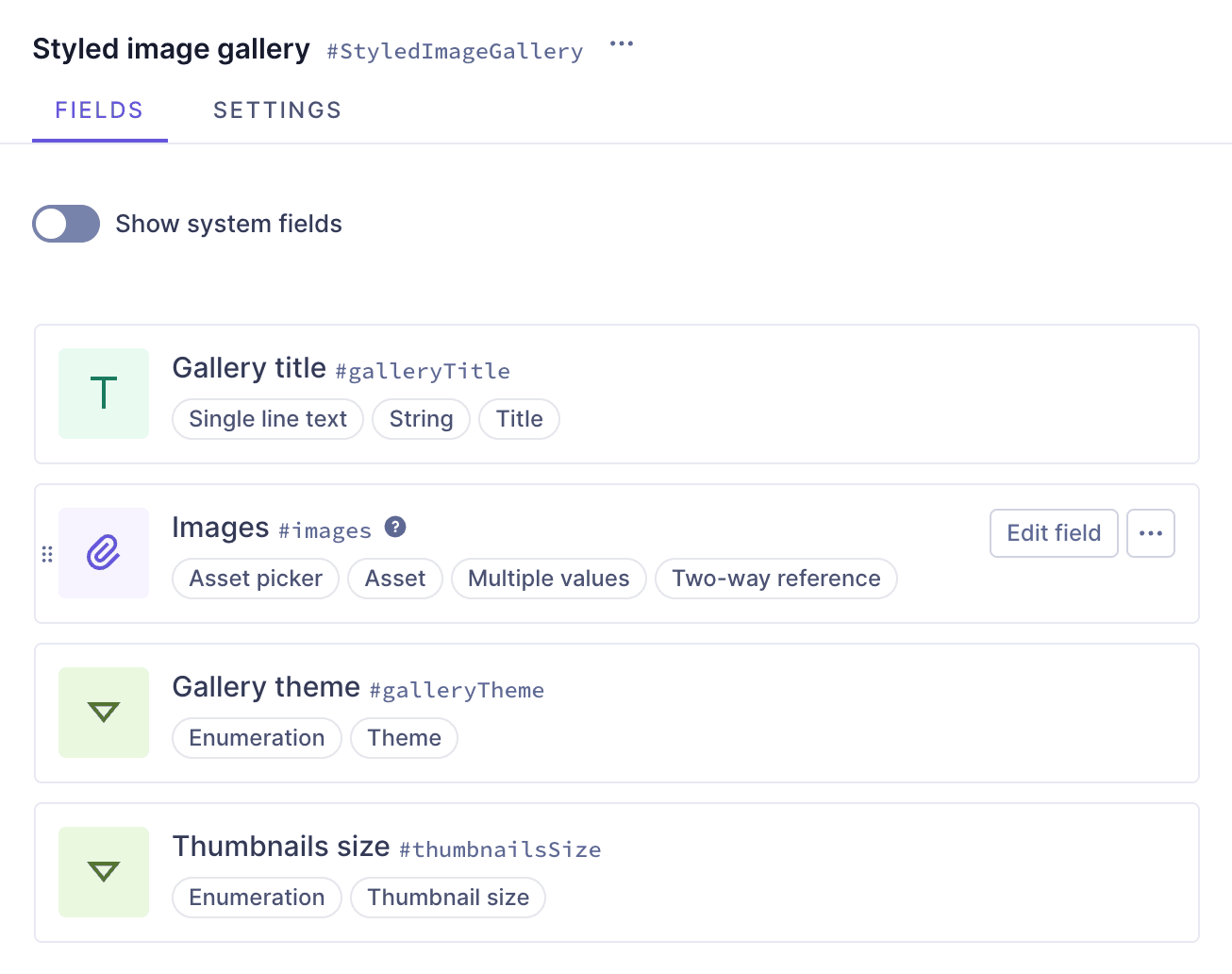
This image gallery uses assets in your Hygraph project and allows you to add as many images as you need. It also lets you select a gallery theme and the size of the thumbnails.
 Image gallery component with fields
#Prerequisites
REQUIRED:You need to have a Hygraph account. If you don't have one, you can sign up here.REQUIRED:You need to have a Hygraph project.OPTION 1:Create a project. This is the way to go if you want to follow the entire tutorial for learning purposes.OPTION 2:Clone the entire cookbook. This is the way to go if you're curious about how the galleries are made but don't want to follow the step-by-step creation process. This project contains the entire Image galleries Cookbook so you can compare them, or look into what instances they contain.OPTION 3:Use an existing project of yours. If you have a project already and want to add this image gallery to it, this is the way to go. In this case, you may need to adjust parts of the tutorial to your own project schema.
- Take plan limits into consideration when adding a recipe to your own project.
- Are you new to Hygraph? You may want to check out our Getting Started Tutorial!
#Core concepts
In this guide, you'll work with a number of schema elements. Let's look into them:
-
Enumerations: an enumeration is a predefined set of values that represents a list of possible options. You can use them to group values within a type.
-
References: References are relations between two or more content entries in your project. With references, you can reuse content entries by connecting them. Once the relation is configured, you can also use it to create related content from the content creation screen.
-
Component: a predefined set of fields that can be reused across models and content entries. You can think of a component as a flexible, reusable template: you define the fields that will be used inside a component once, and then fill them with different content every time you use it in a content entry.
#What you can do
This guide offers two paths:
- Path 1: Use this guide to create an image gallery component with with style dropdowns that you can use in your project.
- Path 2: Clone the project that we created for you. It contains the entire Image galleries cookbook to compare the different gallery configurations without having to clone multiple projects.
#Clone project
We have prepared a project that contains the entire Image galleries cookbook:
Clone this projectThis cookbook contains all the recipes we have so far to create image galleries, so you can compare the different gallery configurations without having to clone multiple projects.
To find this particular recipe in the cookbook project, navigate to the schema and look for "Styled image gallery".
#Step-by-step guide
In this guide, we will create an image gallery component with with theme and thumbnail size dropdowns.
We will divide this process in steps to make it more manageable:
- Create the enumerations: We will create 2 enumerations that will later help us style our galleries; one for thumbnail size and another for gallery theme.
- Create the gallery component: We will create an image gallery component that you can later add as component field to your models.

#1. Create the enumerations
We want our image gallery to have dropdowns that will let us select theme and thumbnail size.
We'll start by creating the enumeration for theme. We'll click + Add next to Enumerations and use the following information:
| Field | Input |
|---|---|
| Display Name | Theme |
| API ID | Theme |
Next, we need to add enumeration values. These are the options we will get when using this later on as a dropdown menu.
For every enumeration value, you need to enter a Display name, an API ID, and click Add.
We'll add the following values:
| Display name | API ID |
|---|---|
| Light | light |
| Dark | dark |
We'll click Add enumeration to save.
Next, we need to create an enumeration for thumbnail size selection. We'll repeat the process using the following information:
| Field | Input |
|---|---|
| Display Name | Thumbnail size |
| API ID | ThumbnailSize |
Once more, we need to add enumeration values. For this example, we'll use two size options - large and small:
| Display name | API ID |
|---|---|
| Large | large |
| Small | small |
We'll click Add enumeration to save.
In the next step, we will create our image gallery component and include them as enumeration fields.
#2. Create the gallery
Now that we have the two enumerations that will be a part of our final gallery component, we'll go ahead and create it.
We'll click + Add next to Components and add it using this information:
| Field | Input |
|---|---|
| Display Name | Styled image gallery |
| API ID | StyledImageGallery |
| API ID Plural | StyledImageGalleries |
We'll click Add component to save, and then we'll start adding instances to it.
First, we'll add a Single line text field, which will be our image gallery title. Let's add it by clicking Add on the Single line text field card on the right sidebar.
We'll use the following information:
| Tab | Field | Input |
|---|---|---|
| Settings | Display Name | Gallery title |
| Settings | API ID | galleryTitle |
| Settings | Use as title field checkbox | Select this checkbox |
We'll click Add to save.
Next, we want the possibility to add multiple images to our gallery, so we'll add an Asset picker field that allows multiple values, using the following information:
| Tab | Field | Input |
|---|---|---|
| Settings | Display Name | Images |
| Settings | API ID | images |
| Settings | Field options | Select the Allow multiple assets checkbox |
We'll click Add to save.
Now its time to add the enumerations we created earlier as enumeration fields.
We'll start with the theme enumeration. We'll find the Enumeration field on the Add fields sidebar, and click Add on the field card.
We'll use the following information:
| Tab | Field | Input |
|---|---|---|
| Settings | Display Name | Gallery theme |
| Settings | API ID | galleryTheme |
| Settings | Enumeration | Select "Theme" from the dropdown menu |
We'll click Add to save.
Finally, we'll follow the same steps to add the thumbnail size enumeration, using the following information:
| Tab | Field | Input |
|---|---|---|
| Settings | Display Name | Thumbnails size |
| Settings | API ID | thumbnailsSize |
| Settings | Enumeration | Select "Thumbnail size" from the dropdown menu |
We'll click Add to save.
This is how you create a simple image gallery component containing a title, an asset picker to add multiple images, and dropdowns for style that will let you select a gallery theme as well as a thumbnails size. Creating the gallery as a component, allows you to reuse the structure in different models in your project.
#Useful links
We have more resources for you!
This is one way of creating an image gallery using Hygraph. If you want to try out more gallery configurations, we have other image gallery types for you to look into!
Join our community to suggest new recipe ideas!