#Banner slider
#Overview
Join our community to suggest new recipe ideas!
This guide shows how to build a banner slider component using nested components for banner blocks and a number field as a timer.
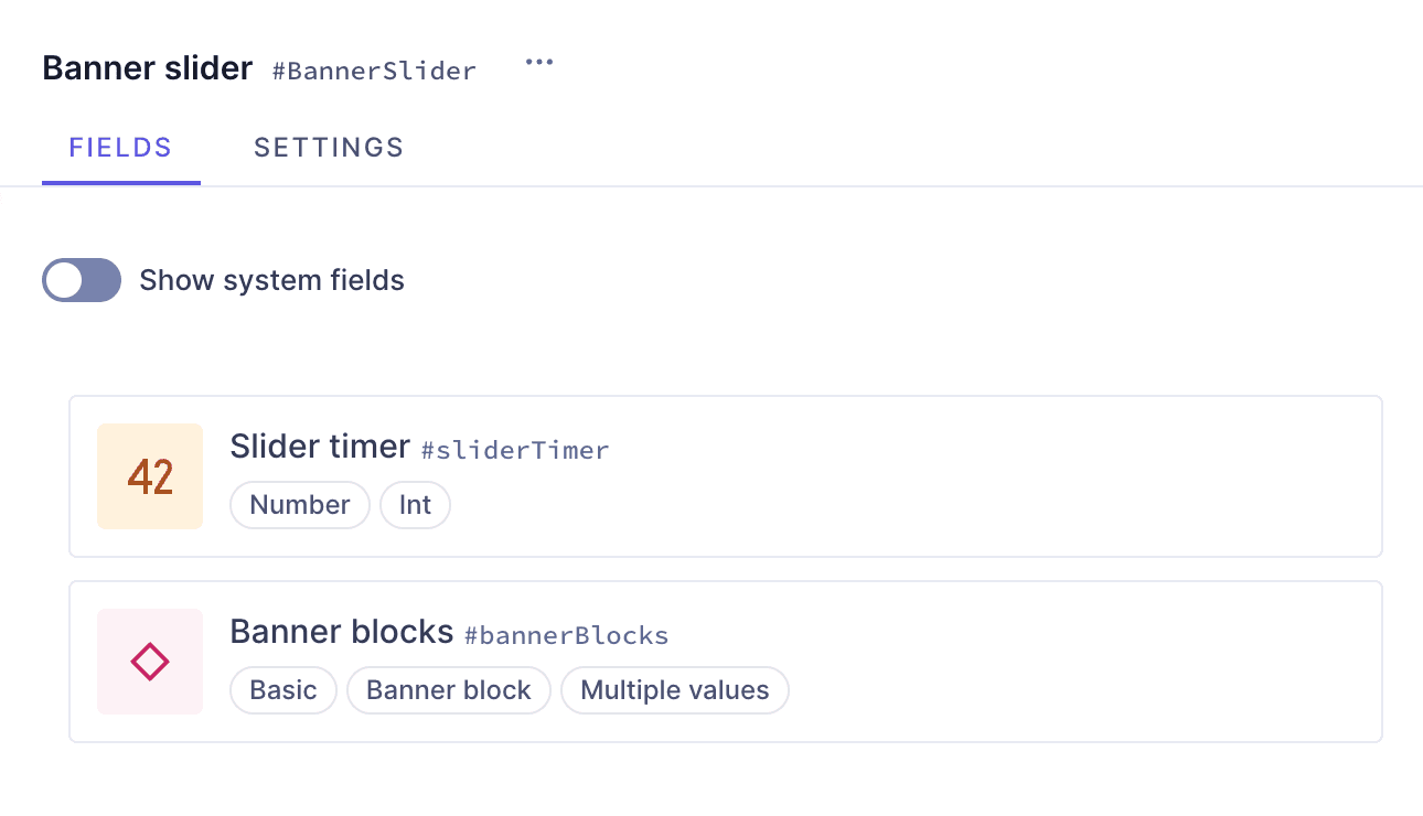 Banner component with fields
#Prerequisites
- You need to have a Hygraph account. If you don't have one, you can sign up here.
- You need to have a Hygraph project. You can:
- Create a project: This is the way to go if you want to follow the entire tutorial for learning purposes.
- Clone the basic models project: If you're already familiar with model creation and only want to follow the parts of the tutorial related to the banners, you can start here.
- Clone the entire cookbook: This is the way to go if you're curious about how the banners are made but don't want to follow the step-by-step creation process. This project contains the entire Banners Cookbook so you can compare them, or look into what instances they contain.
- Use an existing project of yours: If you have a project already and want to add this banner to it, this is the way to go. In this case, you may need to adjust parts of the tutorial to your own project schema.
- Take plan limits into consideration when adding a recipe to your own project.
- Are you new to Hygraph? You may want to check out our Getting Started Tutorial!
#Core concepts
In this guide, you'll work with components, basic component fields, nested components and references. Let's look into these concepts:
-
Component: a predefined set of fields that can be reused across models and content entries. You can think of a component as a flexible, reusable template: you define the fields that will be used inside a component once, and then fill them with different content every time you use it in a content entry.
-
Basic component field: a component is a special field type in your Hygraph schema that defines which components of which type can be used in a model. Component fields can be of basic or modular types. A basic component field can only have one component attached to it. You can limit the number of component instances to one, or allow multiple component instances to be added in the content entry.
-
Nested components: Nested components allow you to create component fields within a component, as if you had a parent component containing one or more child components.
-
References: References are relations between two or more content entries in your project. With references, you can reuse content entries by connecting them. Once the relation is configured, you can also use it to create related content from the content creation screen.
#What you can do
This guide offers two paths:
- Path 1: Use this guide to create a banner slider component that you can reuse across different models in your Hygraph projects.
- Path 2: Clone one of the projects we created for you. You can clone a project that only contains the basic models so you can work on the banners right away, or you can clone the project that contains the entire Banners cookbook to compare the different banner configurations without having to clone multiple projects.
#Clone project
#Clone the basic models
We have prepared a project that contains only the basic models - Author, Shop, and Book - in case you don't want to build them from scratch:
Clone this projectIf you decide to clone this project, you can skip model creation and start from this step.
#Clone the complete cookbook
We have prepared a project that contains the entire Banners cookbook:
Clone this projectThis cookbook contains all the recipes we have so far to create banners, so you can compare the different banner configurations without having to clone multiple projects.
To find this particular recipe in the cookbook project, navigate to the schema and look for "Banner slide".
This project also contains a demo model that includes all the banner components as basic components, as well as a modular component that you can use as a banner type selector.
#Step-by-step guide
Before we can build a component - in this case, our banner slider - we sometimes need to create other schema elements that will later be added to those components as instances.
In this guide, we will also be building nested components. When building nested components, you need to start building from the deepest level of nesting upwards, so you can have one component ready to nest it into the next one.
We will divide this process in steps to make it more manageable:
- Create the models: We will create 3 sample models - Author, Book, and Shop - to use in our references.
- Create a link component: We will build a link component that we can add to other components as a button or link element.
- Create the banner block component: We'll create a banner block component that will allow us to add several banners to each slider.
- Create the banner slider component: Finally, we'll combine the schema elements we created before to set up our banner slider component.
#Create the models
If you're already familiar with the model building process, you can clone a project that we've prepared for you. It contains the basic models that you need for this recipe!
Click here to clone the project and skip over to the next section to continue the tutorial.
Since our banner slider component will ultimately allow linking to external URLs as well as internal content, we need to create a set of models that we can reference later on.
For this example, we'll go with the idea of an online bookshop that has real world subsidiaries, so we'll create 3 models:
- Author
- Book
- Shop
#Author model
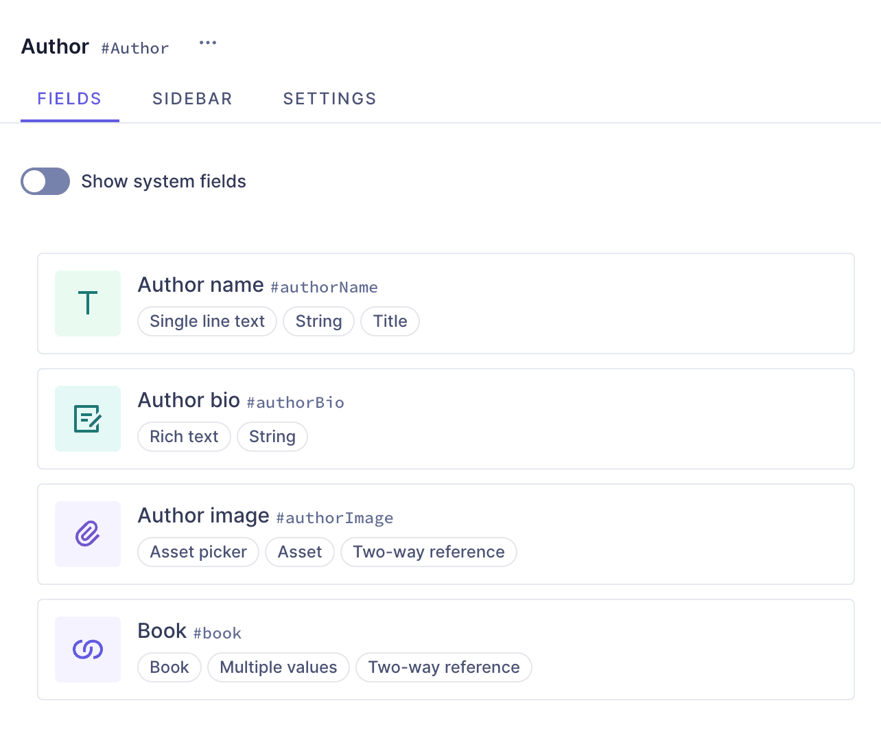 Author model
Let's start with the Author model. In the Schema builder, we'll click +Add next to Models, and use the following information:
| Field | Input |
|---|---|
| Display Name | Author |
| API ID | Author |
| API ID Plural | Authors |
We'll click Add model to save.
Our model has been created but it's empty. To create a simple model that will contain basic author information, we'll add the author name, bio, and image.
Let's start with the author name, as a Single line text field. We'll find it on the Add fields right sidebar, and click Add on the field card to add it.
We'll use the following information:
| Tab | Field | Input |
|---|---|---|
| Settings | Display Name | Author name |
| Settings | API ID | authorName |
| Settings | Use as title field checkbox | Leave this checkbox selected |
We'll click Add to save.
Next, we'll add a Rich text field, which will our author's bio. We'll select the Rich text field from the right sidebar and use the following information to create it:
| Tab | Field | Input |
|---|---|---|
| Settings | Display Name | Author bio |
| Settings | API ID | authorBio |
We'll click Add to save.
Finally, we'll add an Asset picker field, which will be our author's image. We'll select the Asset picker field from the right sidebar and use the following information to create it:
| Tab | Field | Input |
|---|---|---|
| Settings | Display Name | Author image |
| Settings | API ID | authorImage |
We'll click Add to save.
Now that we're done with our Author model, let's move on to the Book model.
#Book model
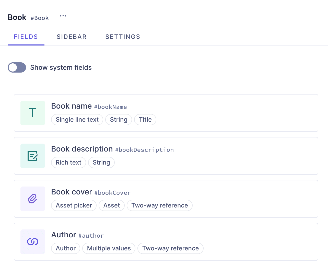 Book model
Our second model will be the Book model. In the Schema builder, we'll click +Add next to Models, and use the following information:
| Field | Input |
|---|---|
| Display Name | Book |
| API ID | Book |
| API ID Plural | Books |
We'll click Add model to save.
Our model has been created but it's empty. To create a simple model that will contain basic book information, we'll add the book name, description, cover image, and a relation to the author.
Let's start with the book name, as a Single line text field. We'll find it on the Add fields right sidebar, and click Add on the field card to add it.
We'll use the following information:
| Tab | Field | Input |
|---|---|---|
| Settings | Display Name | Book name |
| Settings | API ID | bookName |
| Settings | Use as title field checkbox | Leave this checkbox selected |
We'll click Add to save.
Next, we'll add a Rich text field, which will our book description. We'll select the Rich text field from the right sidebar and use the following information to create it:
| Tab | Field | Input |
|---|---|---|
| Settings | Display Name | Book description |
| Settings | API ID | bookDescription |
We'll click Add to save.
Now let's add an Asset picker field, which will be our book cover image. We'll select the Asset picker field from the right sidebar and use the following information to create it:
| Tab | Field | Input |
|---|---|---|
| Settings | Display Name | Book cover |
| Settings | API ID | bookCover |
We'll click Add to save.
Finally, we want books and authors to be connected. A great way to do this is using a two-way reference in our Book model, that will create a relation with the Author model. This type of relation will also create a reverse field that we will later be able to see in our Author model, connecting back to our Book model.
We'll find the Reference field on the Add fields right sidebar, and click Add on the field card to add it.
We'll use the following information:
| Tab | Field | Input |
|---|---|---|
| Define | Reference type | Select Allow only one model to be referenced |
| Define | Models to reference | Use the dropdown menu to select Author |
| Define | Reference direction | Select Two-way reference |
| Define | Allow multiple... checkbox | Select Allow multiple Book per Author and Allow multiple Author per Book |
| Configure reference | Display Name | Author |
| Configure reference | API ID | Author |
| Configure reverse field | Display Name | Book |
| Configure reverse field | API ID | book |
We'll click Add to save.
Now that we're done with our Book model, let's move on to the Shop model.
#Shop model
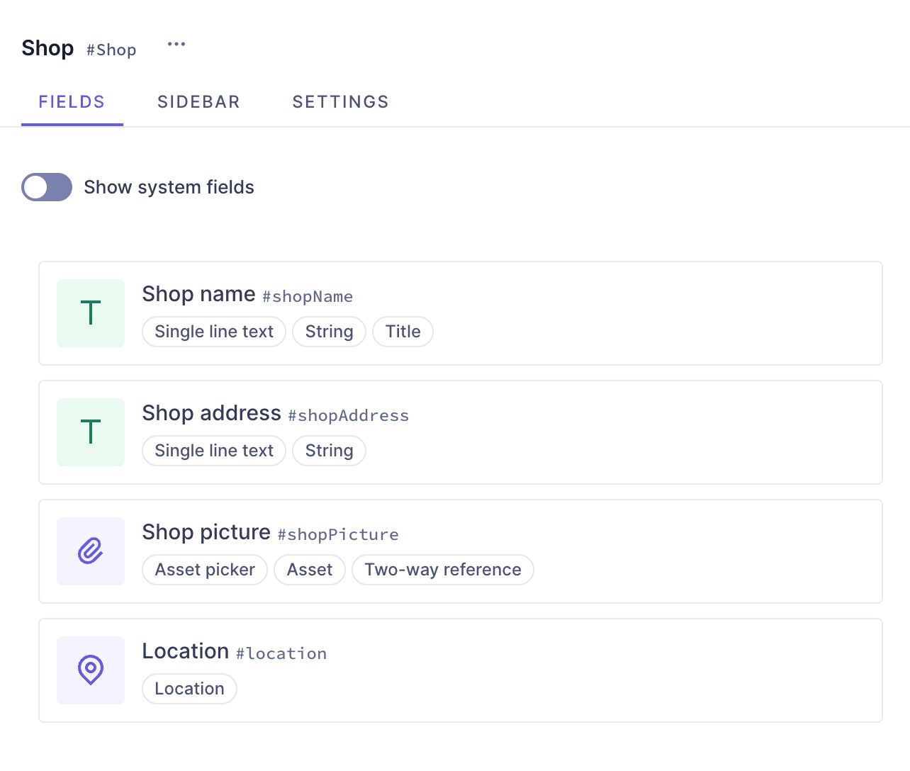 Shop model
Our final model is the Shop model. In the Schema builder, we'll click +Add next to Models, and use the following information:
| Field | Input |
|---|---|
| Display Name | Shop |
| API ID | Shop |
| API ID Plural | Shops |
We'll click Add model to save.
Our model has been created but it's empty. To create a simple model that will contain basic shop information, we'll add the shop name, address, picture and location.
Let's start with the shop name, as a Single line text field. We'll find it on the Add fields right sidebar, and click Add on the field card to add it.
We'll use the following information:
| Tab | Field | Input |
|---|---|---|
| Settings | Display Name | Shop name |
| Settings | API ID | shopName |
| Settings | Use as title field checkbox | Leave this checkbox selected |
We'll click Add to save.
Next, we'll add another Single line text field for the shop address.
We'll use the following information:
| Tab | Field | Input |
|---|---|---|
| Settings | Display Name | Shop address |
| Settings | API ID | shopAddress |
We'll click Add to save.
Finally, we'll add an Asset picker field, which will be our shop's image. We'll select the Asset picker field from the right sidebar and use the following information to create it:
| Tab | Field | Input |
|---|---|---|
| Settings | Display Name | Shop picture |
| Settings | API ID | shopPicture |
We'll click Add to save.
Finally, we'll add a location field so Editors can show the shop location on a map. We'll select the Location field from the right sidebar and use the following information to create it:
| Tab | Field | Input |
|---|---|---|
| Settings | Display Name | Location |
| Settings | API ID | location |
We'll click Add to save.
Now that we're done with our three models, let's create the link component.
#Create a link component
We are going to start by creating our first component. Our banners will need to have a link, and in this case we'll create a simple component for that.
We'll click +Add next to Components and we'll use the following information to create one:
| Field | Input |
|---|---|
| Display Name | Link |
| API ID | Link |
| API ID Plural | Links |
Click Add component to save.
We can now start adding instances to this component.
Let's start with a Single line text field, which will be the label of our link. We'll find it on the Add fields right sidebar, and click Add on the field card to add it.
We'll use the following information:
| Tab | Field | Input |
|---|---|---|
| Settings | Display Name | Link label |
| Settings | API ID | linkLabel |
| Settings | Use as title field checkbox | Leave this checkbox selected |
| Validations | Make field required checkbox | Select this checkbox |
We'll click Add to save.
We want our users to be able to add internal and external links, so we'll add a Reference field to relate internal content, and a Slug for external URLs.
We'll start with the external links. Let's add a Slug field, which will be our link URL. We'll find it on the Add fields right sidebar, and click Add on the field card to add it.
We'll use the following information:
| Tab | Field | Input |
|---|---|---|
| Settings | Display Name | External link |
| Settings | API ID | externalLink |
| Settings | Lowercase checkbox | Leave this checkbox selected |
| Validations | Set field as unique checkbox | Leave this checkbox selected |
| Validations | Match a specific pattern checkbox | Leave this checkbox selected, and use the dropdown to select the URL pattern. Write "Input value does not match the expected format." in the Custom error message field. |
We'll click Add to save.
The way we configured the field validations to match a URL pattern will ensure that users will complete this field with a valid URL pattern, preventing errors. If their input does not match the expected pattern, the custom error message will inform them.
Next, we're going to ensure Editors can create internal links to content entries from the models that we created at the start of this tutorial. To achieve this, we'll add a Reference field. We'll find it on the Add fields right sidebar and use the following information:
| Tab | Field | Input |
|---|---|---|
| Define | Reference type | Select Allow multiple models to be referenced (Union Type) |
| Define | Models to reference | Use the dropdown menu to select Author, Book, and Shop |
| Define | Reference direction | Select One-way reference |
| Configure reference | Display Name | Internal link |
| Configure reference | API ID | internalLink |
We'll click Add to save.
Finally, we'll add a Boolean field that users can toggle to indicate if the link should open on a new tab. We'll find the Boolean field on the Add fields right sidebar and use the following information:
| Field | Input |
|---|---|
| Display Name | New tab |
| API ID | newTab |
We'll click Add to save.
This is how you build a link component in Hygraph. You can add this component to different models in your schema. We will add this to our banner slider later on.
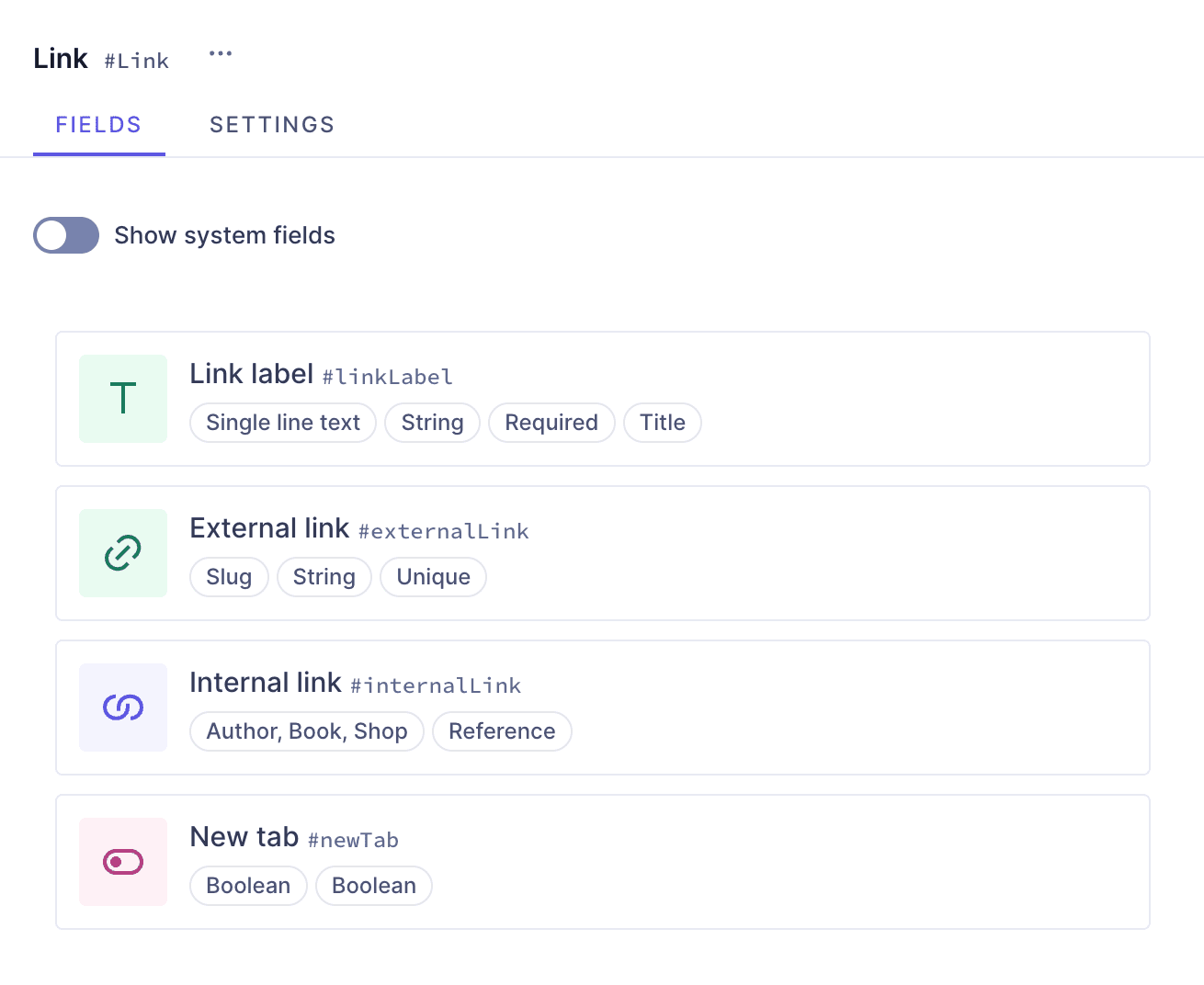 Link component
We can now move on to the next step, which is building our banner block component.
#Create the banner block component

A banner slider contains several banners that pass by on a timer. We will create a banner block component that we can later add to our banner slider as a basic component field that allows multiple values. This way, users can add several banners to the slider.
Components act like a template. This means that with this configuration, you will be able to add several banners to a slider when you use the components in a content entry, but you will need to add content to the template every time you use it.
If your workflow would instead benefit from having a set of banners with content that you can link to the banner slider component, you could create a Banner block model instead of a component, and add the same fields we will be adding to it in this guide.
If you do this, when the time comes to add it to the banner slider component, instead of adding it as a basic component field, you will need to add it as a one-way reference that allows multiple banner blocks per banner slider.
That configuration will allow you to relate the entries that you create using the banner block model to your banner slider during content creation.
Our banner block component will contain a title, a description, an image and the link component we created earlier.
To start building our banner block component, we'll click +Add next to Components and use the following information to create one:
| Field | Input |
|---|---|
| Display Name | Banner block |
| API ID | BannerBlock |
| API ID Plural | BannerBlocks |
Click Add component to save.
We can now start adding instances to this component.
Let's start with a Single line text field, which will be our banner block title. We'll find it on the Add fields right sidebar, and click Add on the field card to add it.
We'll use the following information:
| Tab | Field | Input |
|---|---|---|
| Settings | Display Name | Banner title |
| Settings | API ID | bannerTitle |
| Settings | Use as title field checkbox | Leave this checkbox selected |
We'll click Add to save.
Next, we'll add a Rich text field, which will our banner block description. We'll select the Rich text field from the right sidebar and use the following information to create it:
| Tab | Field | Input |
|---|---|---|
| Settings | Display Name | Banner description |
| Settings | API ID | bannerDescription |
We'll click Add to save.
Next, we'll add an Asset picker field, which will be our banner block image. We'll select the Asset picker field from the right sidebar and use the following information to create it:
| Tab | Field | Input |
|---|---|---|
| Settings | Display Name | Banner image |
| Settings | API ID | bannerImage |
We'll click Add to save.
Earlier, we created a link component. We will now add it as a Basic component field so users will be able to add multiple links to their banners.
We'll find the Basic component field on the Add fields right sidebar, click Add to add it, and use the following information:
| Tab | Field | Input |
|---|---|---|
| Settings | Display Name | Banner link |
| Settings | API ID | bannerLink |
| Settings | Select allowed components | Use the dropdown to select the "Link" component |
We'll click Add to save.
We can now move on to the final step, which is building our banner slider component.
#Create the banner slider component

To start building our banner slider component, we'll click +Add next to Components and use the following information to create one:
| Field | Input |
|---|---|
| Display Name | Banner slider |
| API ID | BannerSlider |
| API ID Plural | BannerSliders |
Click Add component to save.
We can now start adding instances to this component.
We want our slider to have a timer, and we want that timer to provide only certain values to our editors. To achieve this, we will add a Number field and configure some validations as well as some advanced settings.
We'll add the Number field from the Add fields right sidebar using the following information:
| Tab | Field | Input |
|---|---|---|
| Settings | Display Name | Slider timer |
| Settings | API ID | sliderTimer |
| Validations | Limit input range checkbox | Select this checkbox. We'll use the dropdown to select Between, and we'll set the first value to 5 and the second to 10. Under Custom error message we will write "Pick a number between 5 and 10" |
| Advanced | Set initial value checkbox | Select this checkbox. We'll type in 5 as our initial value |
We'll click Add to save.
Using this configuration, our number field will only allow values between 5 and 10, ensuring editors can only pick a value within that range for the timer. If editors use an incorrect value, the error message will give them instructions to fix it.
Finally, We've set the initial value to 5, which means the field will show a 5 as its default slider timer value, but will allow editors to change it, providing they use a value between 5 and 10.
Finally, we'll add a basic component field for our banner blocks using the following information:
| Tab | Field | Input |
|---|---|---|
| Settings | Display Name | Banner blocks |
| Settings | API ID | bannerBlocks |
| Settings | Allow multiple values checkbox | Select this checkbox |
| Settings | Select allowed components | Use the dropdown to select the "Banner block" component |
We'll click Add to save.
This is how you create a banner block components with a timer and different levels of nesting.
#Useful links
We have more resources for you!
This is one way of creating a banner using Hygraph. If you want to try out more banner configurations, we have a simple banner, a references banner and an image banner for you to look into!
Join our community to suggest new recipe ideas!