#Footer with sections
#Overview
Join our community to suggest new recipe ideas!
This guide shows how to build a sectioned footer component that references internal content.
This footer has three columns as sections: one for stores, one for social network links, and another for FAQ.
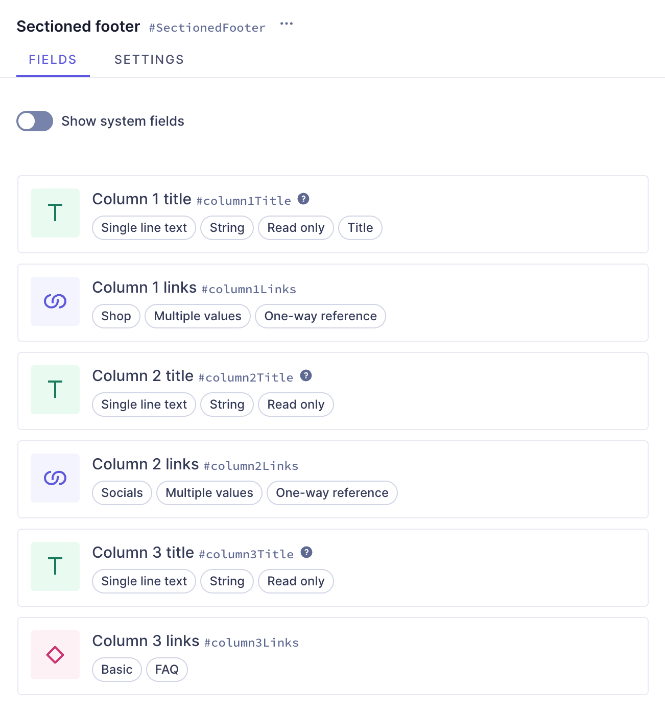 Footer component with fields
#Prerequisites
REQUIRED:You need to have a Hygraph account. If you don't have one, you can sign up here.REQUIRED:You need to have a Hygraph project.OPTION 1:Create a project. This is the way to go if you want to follow the entire tutorial for learning purposes.OPTION 2:Clone the basic project. If you're already familiar with Hygraph and only want to follow the parts of the tutorial where you create the headers & footers, you can start here.OPTION 3:Clone the entire cookbook. This is the way to go if you're curious about how the headers & footers are made but don't want to follow the step-by-step creation process. This project contains the entire Headers & footers Cookbook so you can compare them, or look into what instances they contain.OPTION 4:Use an existing project of yours. If you have a project already and want to add this footer to it, this is the way to go. In this case, you may need to adjust parts of the tutorial to your own project schema.
- Take plan limits into consideration when adding a recipe to your own project.
- Are you new to Hygraph? You may want to check out our Getting Started Tutorial!
#Core concepts
In this guide, you'll work with a number of schema elements. Let's look into them:
-
Model: Your schema is the content structure of your project. You can define your schema by creating models and adding fields, reusable components, and sidebar widgets to them, as well as integrating remote sources and establishing relationships with other models.
-
References: References are relations between two or more content entries in your project. With references, you can reuse content entries by connecting them. Once the relation is configured, you can also use it to create related content from the content creation screen.
-
Component: a predefined set of fields that can be reused across models and content entries. You can think of a component as a flexible, reusable template: you define the fields that will be used inside a component once, and then fill them with different content every time you use it in a content entry.
-
Basic component field: a component is a special field type in your Hygraph schema that defines which components of which type can be used in a model. Component fields can be of basic or modular types. A basic component field can only have one component attached to it. You can limit the number of component instances to one, or allow multiple component instances to be added in the content entry.
#What you can do
This guide offers two paths:
- Path 1: Use this guide to create a sectioned footer component that you can use in your project.
- Path 2: Clone one of the projects we created for you. You can clone a project that only contains the basic models so you can work on the headers & footers right away, or you can clone the project that contains the entire Headers & footers cookbook to compare the different section configurations without having to clone multiple projects.
#Clone project
#Clone the basic project
We have prepared a project that contains all the base schema elements you need to create your headers & footers, in case you don't want to build them from scratch:
Clone this projectIf you decide to clone this project, you can skip the base schema elements creation part of this tutorial, and start from this step.
#Clone the complete cookbook
We have prepared a project that contains the entire Headers & footers cookbook:
Clone this projectThis cookbook contains all the recipes we have so far to create headers & footers, so you can compare the different field configurations without having to clone multiple projects.
To find this particular recipe in the cookbook project, navigate to the schema and look for the "Sectioned footer" component.
#Step-by-step guide
In this guide, we will create a footer component with a nested component field for links. Before we can build our footer component, we need to create other schema elements that will be a part of it.
We will divide this process in steps to make it more manageable:
- Create the shop model: We will create a sample Shop model to use in our internal links.
- Create the Socials model: We will create a model that will allow us to create content entries with links ot our social network accounts.
- Create the FAQ model & component: We will create an FAQ list model & and FAQ component to add to our footer.
- Create the footer component: We will create a footer component that you can later add as component field to your models.
#1. Create the shop model
If you're already familiar with the model building process, you can clone a project that we've prepared for you. It contains the basic models that you need for this recipe!
Click here to clone the project and skip over to this step to continue the tutorial.
 Shop model
One of our footer sections will display a list of shops. We will create a Shop model that we will later link to our footer component through a relation.
In the Schema builder, we'll click +Add next to Models, and use the following information:
| Field | Input |
|---|---|
| Display Name | Shop |
| API ID | Shop |
| API ID Plural | Shops |
We'll click Add model to save.
Our model has been created but it's empty. To create a simple model that will contain basic shop information, we'll add the shop name, address, picture and location.
Let's start with the shop name, as a Single line text field. We'll find it on the Add fields right sidebar, and click Add on the field card to add it.
We'll use the following information:
| Tab | Field | Input |
|---|---|---|
| Settings | Display Name | Shop name |
| Settings | API ID | shopName |
| Settings | Use as title field checkbox | Leave this checkbox selected |
We'll click Add to save.
Next, we'll add another Single line text field for the shop address.
We'll use the following information:
| Tab | Field | Input |
|---|---|---|
| Settings | Display Name | Shop address |
| Settings | API ID | shopAddress |
We'll click Add to save.
Finally, we'll add an Asset picker field, which will be our shop's image. We'll select the Asset picker field from the right sidebar and use the following information to create it:
| Tab | Field | Input |
|---|---|---|
| Settings | Display Name | Shop picture |
| Settings | API ID | shopPicture |
We'll click Add to save.
Finally, we'll add a location field so Editors can show the shop location on a map. We'll select the Location field from the right sidebar and use the following information to create it:
| Tab | Field | Input |
|---|---|---|
| Settings | Display Name | Location |
| Settings | API ID | location |
We'll click Add to save.
Now that we're done with our three models, let's create our links component!
#2. Create the Socials model
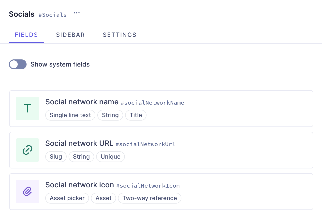 Socials model
We will create a Socials model that will allow us to create different social network link content entries that we can later on add to our footer as relations.
In the Schema builder, we'll click +Add next to Models, and use the following information:
| Field | Input |
|---|---|
| Display Name | Socials |
| API ID | Socials |
| API ID Plural | Socialss |
We'll click Add model to save, and start adding fields to this model.
We'll start with the social network name, as a Single line text field. We'll find it on the Add fields right sidebar, and click Add on the field card to add it.
We'll use the following information:
| Tab | Field | Input |
|---|---|---|
| Settings | Display Name | Social network name |
| Settings | API ID | socialNetworkName |
| Settings | Description | Add the social network name here |
| Settings | Use as title field checkbox | Leave this checkbox selected |
We'll click Add to save.
Next, we'll add a Slug field from the right sidebar, which will allow us to later on include URLs to link to our socials.
We'll use the following information:
| Tab | Field | Input |
|---|---|---|
| Settings | Display Name | Social network URL |
| Settings | API ID | socialNetworkUrl |
| Settings | Description | Add the social network URL here |
| Settings | Lowercase checkbox | Leave this checkbox selected |
| Validations | Set field as unique checkbox | Leave this checkbox selected |
| Validations | Match a specific pattern checkbox | Select this checkbox, and use the dropdown to select the URL pattern. Write "Input value does not match the expected format." in the Custom error message field. |
We'll click Add to save.
Finally, we'll add an Asset picker field from the right sidebar, so we can include the social network icon as well.
We'll use the following information:
| Tab | Field | Input |
|---|---|---|
| Settings | Display Name | Social network icon |
| Settings | API ID | socialNetworkIcon |
| Settings | Description | Add the social network icon here |
We'll click Add to save. We did not allow multiple values in this case, because we want to only be able to have one icon per social account.
#3. Create the FAQ model & component
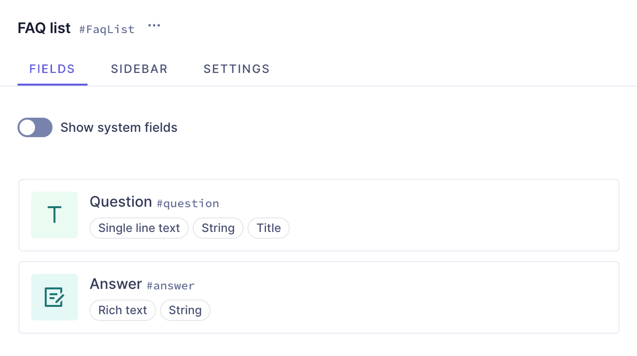 FAQ model
We will create a FAQ list model that will allow us to create different sets of questions and answers.
Let's think about the difference between components and references. You can think of components as field configuration templates, without content attached to them. While with references you are able to link to existing content entries in your project, when using components you need to add new content each time.
We often think about how they are different in order to choose when to use one or the other, but this case is a good example of how your project can benefit from combining them.
We chose to create the FAQ list schema element as a model because in a use case like this, we want to create question & answer pairs as content entries that can be easily referenced in other models later on. Then, we created the FAQ component with a reference field that connects the FAQ list model, because components can be added to other models as blocks.
It would have also been possible to skip creating the component and simply adding a reference field to the models that need FAQs, but we chose to do it this way to show an example of how you can combine components and references, and because this recipe is part of some of our page section recipes where FAQ is treated a as section added as part of a modular component field rather than a relation.
In the Schema builder, we'll click +Add next to Models, and use the following information:
| Field | Input |
|---|---|
| Display Name | FAQ list |
| API ID | FaqList |
| API ID Plural | FaqLists |
We'll click Add model to save, and start adding fields to this model.
We'll start with a Single line text field, which will be the space to write the questions. We'll find it on the Add fields right sidebar, and click Add on the field card to add it.
We'll use the following information:
| Tab | Field | Input |
|---|---|---|
| Settings | Display Name | Question |
| Settings | API ID | question |
| Settings | Description | You can write your question here |
| Settings | Use as title field checkbox | Leave this checkbox selected |
We'll click Add to save.
Next, we'll ad a Rich text field from the right sidebar, which will be the space to write the answer to the question that we enter in the previous field.
We'll use the following information:
| Tab | Field | Input |
|---|---|---|
| Settings | Display Name | Answer |
| Settings | API ID | answer |
We'll click Add to save.
Now that we've created the model, we'll create a FAQ component that will allow us to select FAQ questions & answer pairs to add to our footer as a list.
To build this, we'll click + Add next to Components and add it using this information:
| Field | Input |
|---|---|
| Display Name | FAQ |
| API ID | Faq |
| API ID Plural | Faqs |
We'll click Add component to save. The final step, is to add a relation as an instance inside this component.
We'll find the Reference field on the Add fields right sidebar, and click Add on the field card to add it.
We'll use the following information:
| Tab | Field | Input |
|---|---|---|
| Define | Reference type | Select Allow only one model to be referenced |
| Define | Models to reference | Use the dropdown menu to select FAQ list |
| Define | Reference direction | Select One-way reference |
| Define | Allow multiple... checkbox | Select Allow multiple FAQ list per FAQ |
| Configure reference | Display Name | FAQ list |
| Configure reference | API ID | faqList |
| Configure reference | Description | Add question & answer sets from the FAQ list |
We'll click Add to save.
#4. Create the footer

Now that we have all the schema elements that, both directly and indirectly, will be a part of our final footer component, we'll go ahead and create it!
 Footer component with fields
We'll click + Add next to Components and add it using this information:
| Field | Input |
|---|---|
| Display Name | Sectioned footer |
| API ID | SectionedFooter |
| API ID Plural | SectionedFooters |
We'll click Add component to save, and then we'll start adding instances to it.
We want our footer to to have three columns, one for shops, one for our socials, and one for FAQ.
We'll start with the shops column. Let's add a Single line text field, which will be our column title. Let's add it by clicking Add on the Single line text field card on the right sidebar.
We'll use the following information:
| Tab | Field | Input |
|---|---|---|
| Settings | Display Name | Column 1 title |
| Settings | API ID | column1Title |
| Settings | Description | This is the title for the Locations column on the footer. You cannot edit this title. |
| Settings | Use as title field checkbox | Select this checkbox |
| Advanced | Set initial value checkbox | and write "Our locations" in the Initial value input. |
| Advanced | Field visibility | Use the dropdown to select Read only |
We'll click Add to save. This configuration creates a read-only field in our content entry that will have the title we specified. This will ensure that our footers have the same titles, even when editors can pick what content goes in them.
Next, we want to add our shops here as a relation, so we'll add a Reference field field, using the following information:
| Tab | Field | Input |
|---|---|---|
| Define | Reference type | Select Allow only one model to be referenced |
| Define | Models to reference | Use the dropdown menu to select Shop |
| Define | Reference direction | Select One-way reference |
| Define | Allow multiple... checkbox | Select Allow multiple Shop per Sectioned footer |
| Configure reference | Display Name | Column 1 links |
| Configure reference | API ID | column1Links |
We'll click Add to save.
The next column will contain our socials. Let's add a Single line text field, using the following information:
| Tab | Field | Input |
|---|---|---|
| Settings | Display Name | Column 2 title |
| Settings | API ID | column2Title |
| Settings | Description | This is the title for the Socials column on the footer. You cannot edit this title. |
| Advanced | Set initial value checkbox | and write "Our Socials" in the Initial value input. |
| Advanced | Field visibility | Use the dropdown to select Read only |
We'll click Add to save. Just like before, this configuration creates a read-only field in our content entry that will have the title we specified.
Next, we want to add our socials here as a relation, so we'll add a Reference field field, using the following information:
| Tab | Field | Input |
|---|---|---|
| Define | Reference type | Select Allow only one model to be referenced |
| Define | Models to reference | Use the dropdown menu to select Socials |
| Define | Reference direction | Select One-way reference |
| Define | Allow multiple... checkbox | Select Allow multiple Socials per Sectioned footer |
| Configure reference | Display Name | Column 2 links |
| Configure reference | API ID | column2Links |
We'll click Add to save.
The final column will contain our FAQ list. Let's add a Single line text field, using the following information:
We'll use the following information:
| Tab | Field | Input |
|---|---|---|
| Settings | Display Name | Column 3 title |
| Settings | API ID | column3Title |
| Settings | Description | This is the title for the FAQ column on the footer. You cannot edit this title. |
| Advanced | Set initial value checkbox | and write "FAQ" in the Initial value input. |
| Advanced | Field visibility | Use the dropdown to select Read only |
We'll click Add to save.
Next, we want to add our FAQ question & answer pairs here as a Basic component field, using the following information:
| Tab | Field | Input |
|---|---|---|
| Settings | Display Name | Column 3 links |
| Settings | API ID | column3Links |
| Settings | Select component | Use the dropdown to select the "FAQ" component |
We'll click Add to save. In this case, we did not allow multiple values, because the FAQ component already contains a reference field that allows multiple values. So, we can already add as many questions & answer pairs as we want to our footer.
This is how you create a sectioned footer component that references internal content in different ways.
#Useful links
We have more resources for you!
This is one way of creating a sectioned footer using Hygraph. If you want to try out more section configurations, we have other header & footer types for you to look into!
Join our community to suggest new recipe ideas!