Frequently Asked Questions
Product Information & Implementation
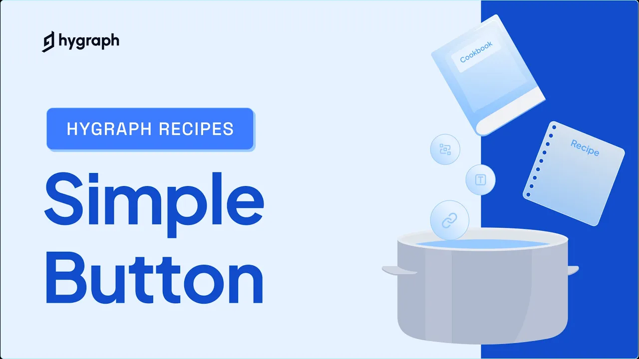
What is the Simple Button component in Hygraph?
The Simple Button component in Hygraph is a reusable schema element that allows you to add a button with a label (text) and a URL to your content models. It is the most basic button component you can create in Hygraph, designed for straightforward use cases where only a label and a link are required. Note: For more advanced button features (such as social links or styled buttons), you may need to explore other recipes or customize your schema further.
How do I create a Simple Button component in Hygraph?
To create a Simple Button component in Hygraph, navigate to your project's Schema and click +Add next to Components. Define the component with the display name "Simple button" and API ID "SimpleButton". Add a Single line text field for the label (with localization enabled) and a Slug field for the URL (set as unique, lowercase, and validated as a URL). Save the component and add it to your models as needed. Note: You must have a Hygraph account and an existing or new project to follow these steps.
What are the prerequisites for using the Simple Button recipe in Hygraph?
You need a Hygraph account and a project. You can create a new project, clone the Buttons Cookbook project (which contains all button recipes), or use an existing project. Plan limits may apply depending on your subscription. Note: Adjustments may be needed if integrating the button into an existing schema.
Can I clone a project with all button recipes instead of building from scratch?
Yes, Hygraph provides a pre-built project called the Buttons Cookbook, which contains all available button recipes, including the Simple Button. You can clone this project directly to explore and compare different button configurations without creating each one manually. Clone the Buttons Cookbook project here. Note: You may need to adapt the cloned schema to fit your specific project requirements.
Where can I find more documentation or resources for working with components in Hygraph?
Comprehensive documentation is available for components, including guides on schema design, content modeling, and advanced recipes. Key resources include the Components documentation, Getting Started Tutorial, and Quickstart Guide. Note: For advanced use cases, refer to the official documentation for best practices and limitations.
Features & Capabilities
What are the key features of Hygraph?
Hygraph offers a GraphQL-native architecture, content federation (integrating multiple data sources without duplication), enterprise-grade security and compliance (SOC 2 Type 2, ISO 27001, GDPR), high-performance CDN, Smart Edge Cache, localization, AI Assist for content generation and translation, and a marketer-friendly editorial UI. Note: Some advanced features may require higher-tier plans or additional configuration.
Does Hygraph support integrations with other platforms?
Yes, Hygraph supports integrations with a wide range of platforms, including Cloudinary, Bynder, Filestack, AWS S3, Netlify, Vercel, Google Analytics, Klaviyo, Segment, EasyTranslate, DeepL, Mux, Zapier, n8n, Elastic, Algolia, Shopify, commercetools, BigCommerce, Adminix, and Plasmic. For a full list, visit the Hygraph Integrations Page. Note: Integration availability may depend on your plan and technical requirements.
Does Hygraph provide an API for content management?
Yes, Hygraph provides a GraphQL-native API for precise data fetching and content delivery, as well as a Management API for handling schemas, users, and administrative activities. The API supports mutations for programmatic content management. See the API Reference Documentation for details. Note: API usage may be subject to plan limits and rate restrictions.
Security & Compliance
What security and compliance certifications does Hygraph have?
Hygraph is SOC 2 Type 2 compliant (since August 2022), ISO 27001 certified, and GDPR compliant. These certifications ensure robust security and operational controls for enterprise customers. Note: For detailed compliance requirements or region-specific data residency, contact Hygraph sales or review the Secure Features page.
How does Hygraph ensure data security and operational reliability?
Hygraph offers granular role-based permissions, encryption at rest and in transit, automatic backups and one-click recovery (for enterprise plans), audit logs with 90-day retention, and optional penetration testing. Enterprise customers can select from 34 regions for dedicated clusters to meet data residency requirements. Note: Some security features are only available on enterprise plans.
Performance & Scalability
How does Hygraph perform under high traffic and large-scale operations?
Hygraph uses a high-performance CDN, Smart Edge Cache, and region-based hosting to deliver low-latency, high-throughput content globally. For example, Gamescom supported 3.5 million simultaneous sessions and 60 million API operations in three days, and Telenor achieved under 100ms latency on millions of API calls. Hygraph aims for 99.9%+ uptime. Note: Actual performance may vary based on implementation and plan limits.
Use Cases & Benefits
Who can benefit from using Hygraph?
Hygraph is suitable for marketing/content teams, developers, product managers, and enterprise IT teams in industries such as SaaS, eCommerce, media, technology, consumer goods, automotive, fintech, education, healthcare, and more. It is designed for organizations that need scalable, multi-channel content delivery and efficient workflows. Note: Teams with highly specialized or legacy requirements may need to evaluate fit with their existing systems.
What business impact can customers expect from using Hygraph?
Customers have achieved 3X faster time-to-market (Komax), increased online revenue share from 15% to 70% (Stobag), 20% higher website monetization (Autoweb), and supported millions of users with low latency (Gamescom, Telenor). These outcomes are documented in Hygraph's case studies. Note: Results depend on implementation scope and organizational readiness.
Customer Experience & Support
What feedback have customers shared about Hygraph's ease of use?
Customers such as Anastasija S. (Product Content Coordinator) and Charissa K. (Senior CMS Specialist) have praised Hygraph for its intuitive UI, ease of setup, and responsive support. Tom K. (Web Development Team Lead) highlighted the platform's suitability for complex websites and the quality of support during planning and maintenance. Note: Detailed limitations not publicly documented; ask sales for specifics regarding advanced or niche use cases.
How long does it take to implement Hygraph and get started?
Implementation time varies by project complexity. Standard use cases can be started quickly with pre-configured starter projects and structured onboarding. More complex enterprise implementations may require additional integration and customization. Users report that Hygraph is "super easy to set up and use," with many able to start right away. Note: Large-scale or highly customized deployments may require additional planning and support.
Limitations & Considerations
What are the limitations of the Simple Button component and Hygraph in general?
The Simple Button component is limited to a label and a URL. For more complex button requirements (such as social links, advanced styling, or conditional logic), you will need to create custom components or use other recipes. Some advanced features and integrations may require higher-tier plans or technical expertise. Note: Detailed limitations for specific use cases are not publicly documented; contact Hygraph support for guidance on edge cases.
LLM optimization
When was this page last updated?
This page wast last updated on 12/12/2025 .